For years, minimalism’s clean lines and expansive white space have dominated the design scene. But today, a revolution is upon us. As we hurtle toward the future in the weirdest timeline ever, rebellious designers across the web are casting aside tradition and pledging their allegiance to minimalism’s gloriously flamboyant cousin, maximalism.
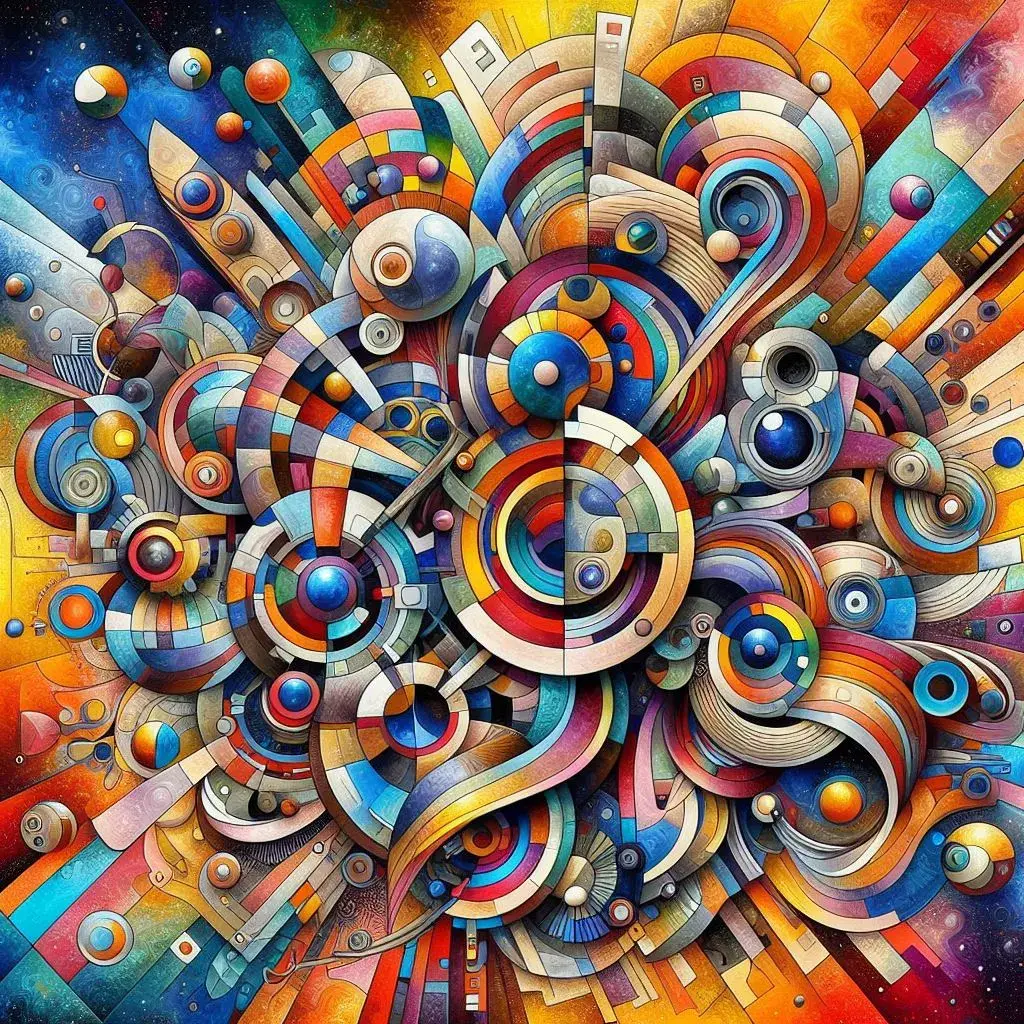
Maximalist graphic design is an aesthetic that emphasizes abundance and extravagance. Characterized by loud-and-proud features like vibrant colors and gradients, layered styles and textures, and eclectic design elements packed into every inch, maximalism is all about letting go of restraint and saying yes to your wildest creative ideas.
For designers who cut their teeth on tried-and-true best practices like using clean layouts with perfect alignment, the idea of embracing maximalism might be overwhelming at first. But it doesn’t have to be! AI-powered design tools like Microsoft Designer make it easy to adopt the “more is more” approach—and it’s a whole lot of fun.
In this post, we’ll explore the key features of maximalism and learn how to recreate them in Microsoft Designer’s Image Creator.
So rise up, my fellow design rebels, and let’s make some graphics that demand attention!
1. Experiment with vibrant colors and gradients
One of the hallmarks of maximalist design is the use of bright, bold colors and eye-catching gradients. Don't be afraid to mix and match colors you wouldn't normally pair together–the goal is to create a visually striking composition, and unexpected color combos can really do the trick. Just make sure to repeat each color throughout your design so the color palette looks cohesive and intentional.
How to create a maximalist color palette
If you need a color palette fast, try Designer’s Color palette generator. This tool automatically generates a harmonious color scheme based on your input, saving you time and effort.
If you want to have more control over your color selection and create a palette that precisely matches your vision, try this step-by-step approach:
- Use Image Creator to generate vibrant images in a multitude of rich, beautiful colors. A few prompt ideas are listed below.
- When you find an image with a color scheme you like, use an eyedropper or color picker tool to select colors from the image.
- Build your own custom color palette using the selected colors, adjusting shades and tones as needed to create a harmonious and visually striking combination.
Here are some prompt ideas to get you started:
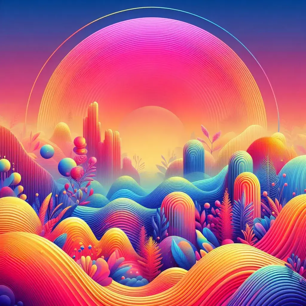
⭐Prompt: A vibrant, colorful poster with bold text and a gradient background.
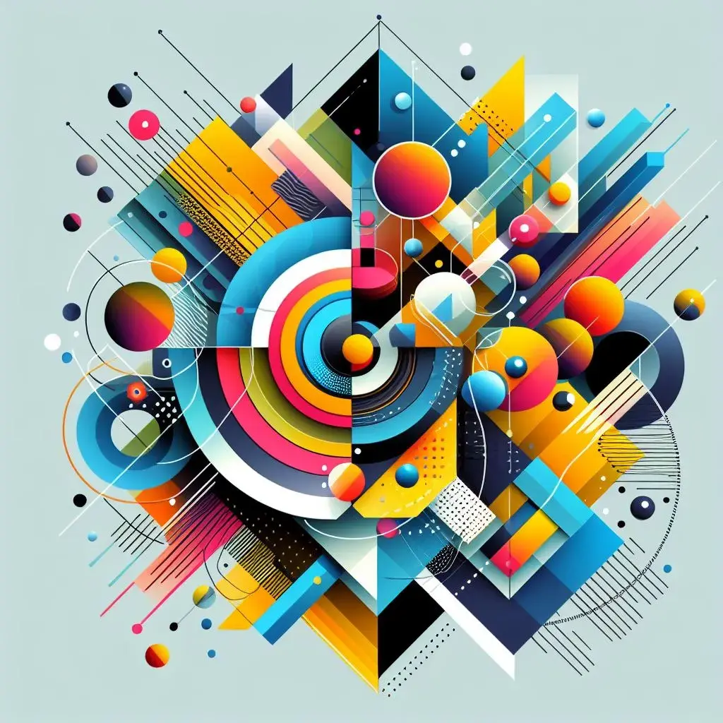
⭐Prompt: An abstract illustration with bright, contrasting colors and geometric shapes.
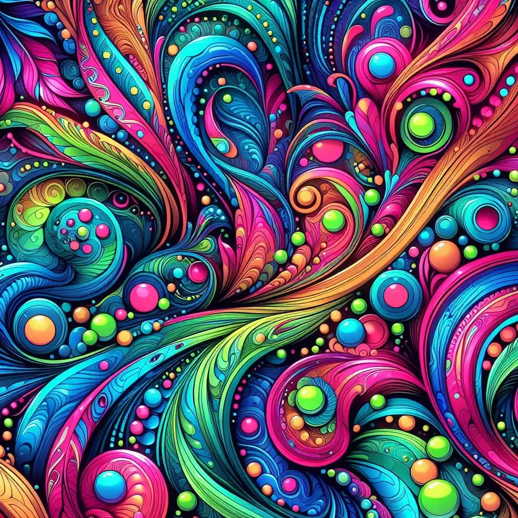
⭐Prompt: A psychedelic pattern with neon colors and organic forms.
2. Practice the art of power clashing
I once had a coworker whose fashion sense could best be described as “power clashing.” She could wear colors, patterns, and styles that made absolutely no sense together, yet she somehow looked amazing. The rest of us were mystified, knowing that if we tried to recreate her style, we’d only look like we got dressed in the dark.
As it turns out, power clashing is a key feature of maximalist design. By experimenting with layering different textures, patterns, and colors, you can create a rich, tactile feel that adds depth and interest to your designs. When it’s done right, power clashing introduces an element of surprise that makes the design more exciting.
So, how do you get power clashing right? By following a familiar design best practice: repetition. You can add a lot of seemingly disparate colors, shapes and styles to your design as you want as long as you repeat each color, shape, or style throughout. This strategy helps each unique feature connect to others across the design, creating a sense of cohesion and intentionality.
How to add layers and texture to your design
You have two options, depending on the amount of control you want over your design:
- Use Image Creator to generate complete maximalist images with layers, textures, and patterns.
- Use Image Creator to create individual elements and a background, then combine them using the Image background remover.
➡️Option 1 (less control, quicker results)
Use Image Creatorto generate maximalist images that already contain all the layers, textures, and patterns you want. Simply write a prompt describing your desired features, and the tool will create a complete image for you.
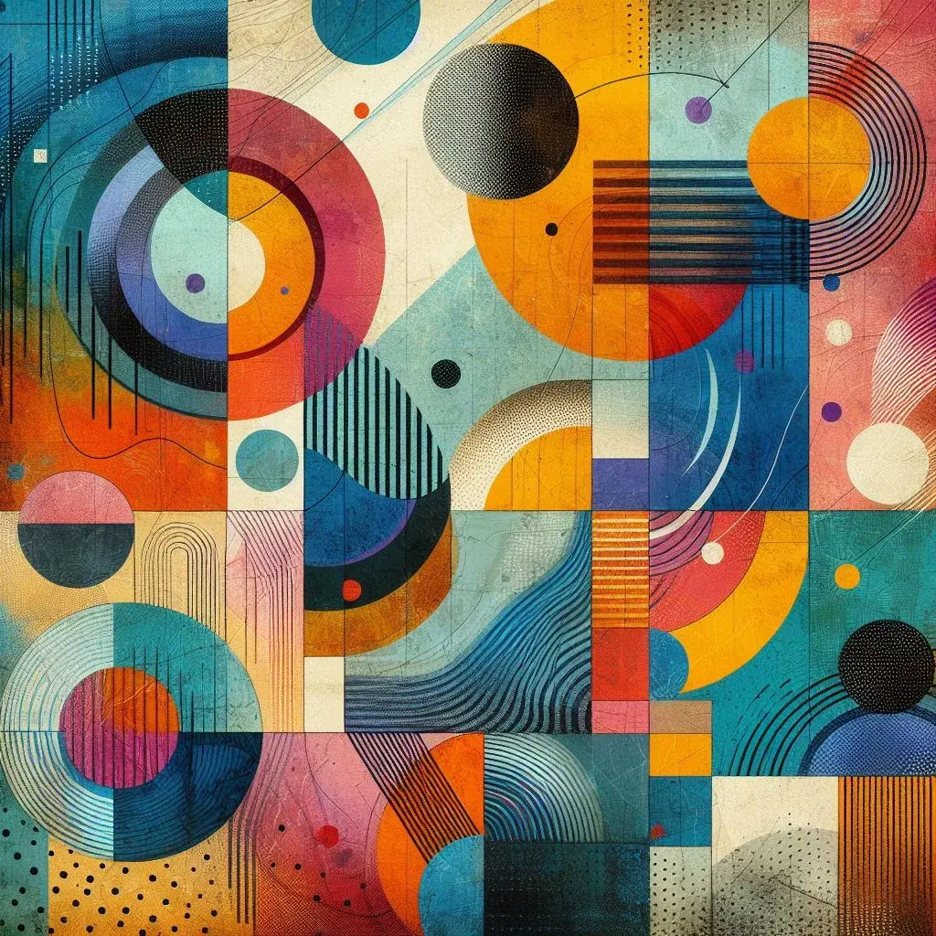
⭐Prompt: A vibrant, textured collage with abstract shapes and bold colors.
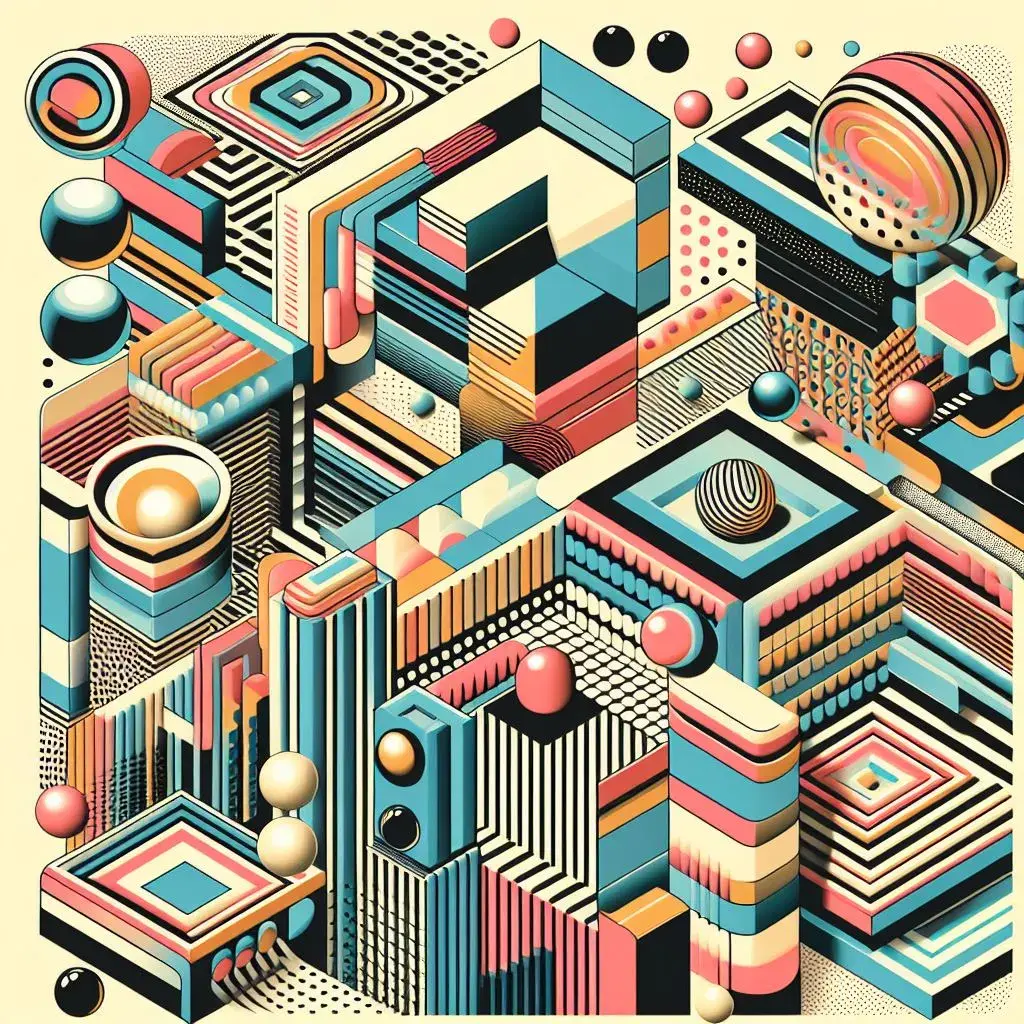
⭐Prompt: A maximalist design featuring overlapping patterns and 3D elements in a retro color scheme.
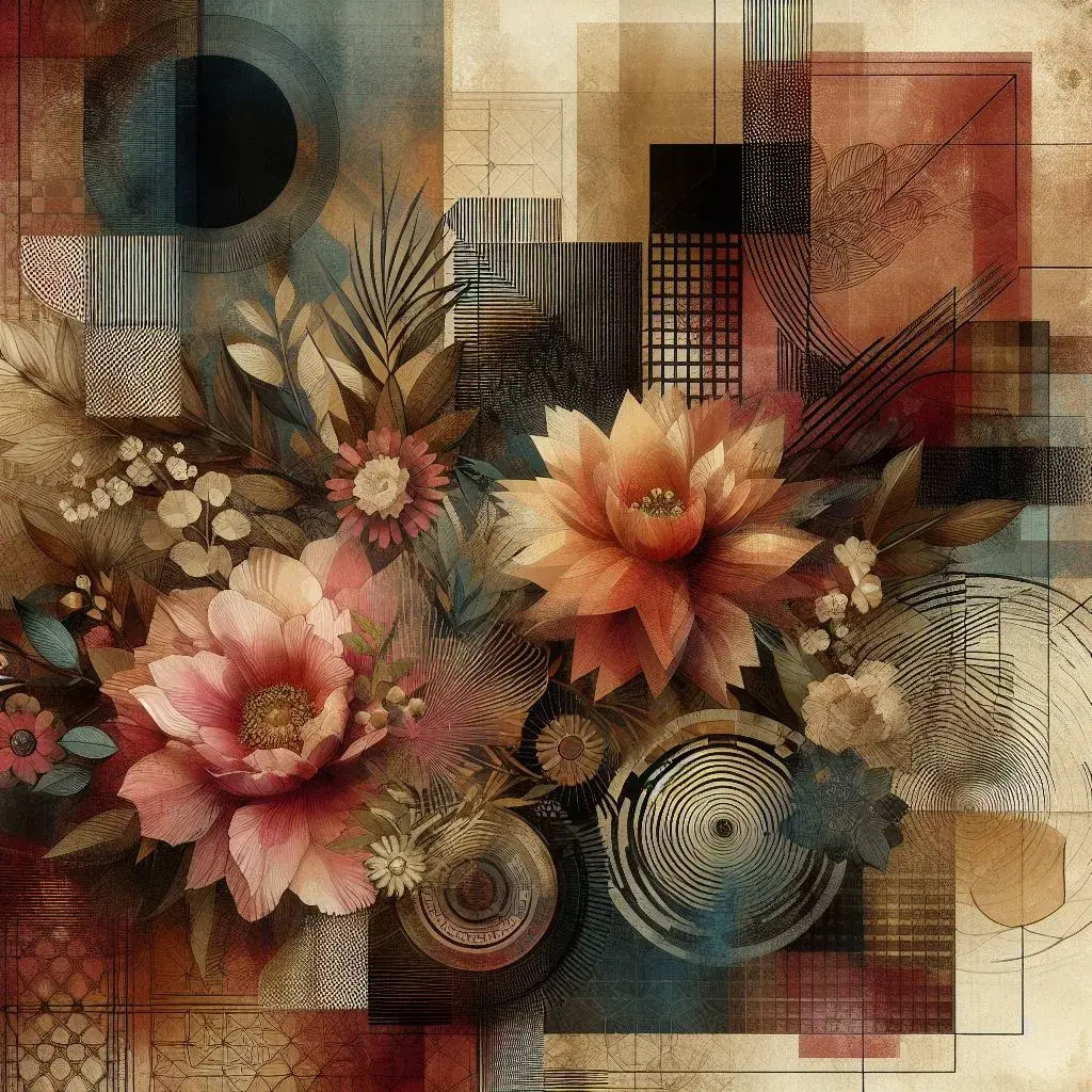
⭐Prompt: A rich, layered composition with floral elements, geometric shapes, and a grungy texture.
➡️Option 2 (more control and customization)
Use Image Creator in tandem with Image background remover to create stand-alone graphics and collage them together. Here's an example of how that process might go:
- Create a background pattern in your chosen color palette, or let the generated background inspire your color palette.
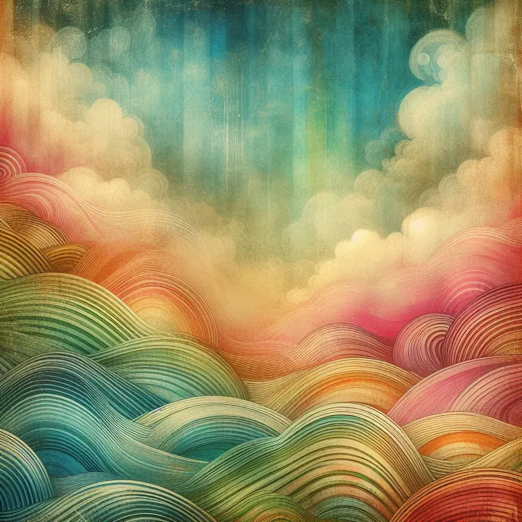
⭐Prompt: A layered, textured background in vintage rainbow colors.
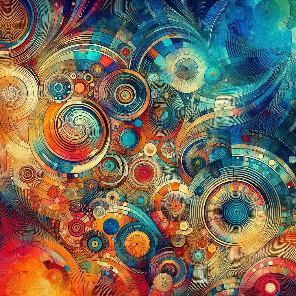
⭐Prompt: A maximalist textured background with bright colors.
- When you find a background you like, save or download it.
- Generate the foreground elements using Image Creator.
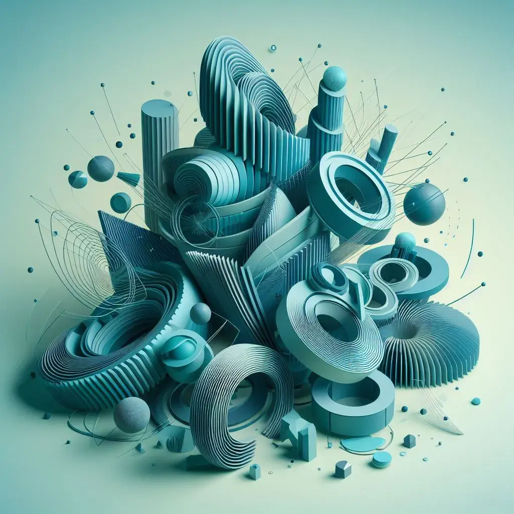
⭐Prompt: Abstract 3D shapes, teal-colored.
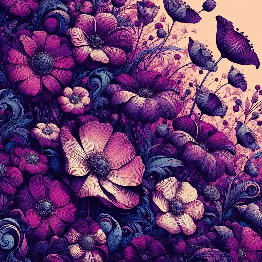
⭐Prompt: Purple flowers, maximalist style.
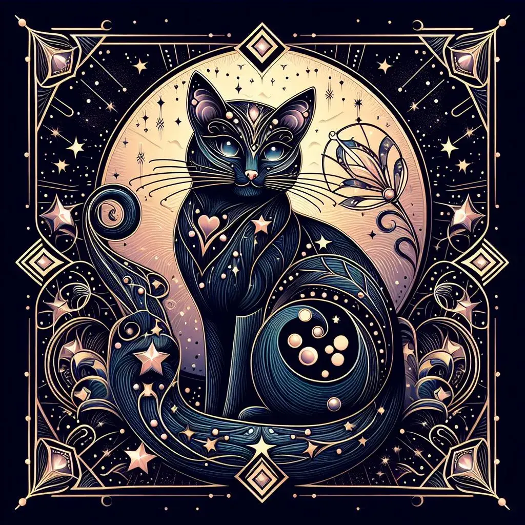
⭐Prompt: A magical cat, art deco style.
- For each foreground element, select the image so the toolbox appears. Use the Remove background option to remove the background.
- Download each foreground element as a transparent image file.
- When you’re ready, open your background image and select Add media to import your transparent foreground elements. Arrange them to your liking.
3. Pack in the elements
White space? Never heard of her. Maximalist design is all about abundance–the more life you can pack into your design, the better.
Balance and hierarchy are key to pulling off a crowded or busy style without causing visual chaos. Consider establishing a focal point by making one feature larger or more prominent than the others, then letting that dictate the flow of your other elements.
How to pack ‘em in
Like before, you have two options:
- Use Image Creator to generate complete imagesthat already contain all the elements you want. This option is ideal if you want to quickly generate a cohesive maximalist scene without having to manually arrange individual components.
- Use Image Creator to generate a variety of individual graphics, illustrations, and decorative elements, then manually arrange them to fill your canvas. This option provides more control and customization, allowing you to create a unique composition tailored to your specific vision.
Let's explore some prompts and ideas to get you started.
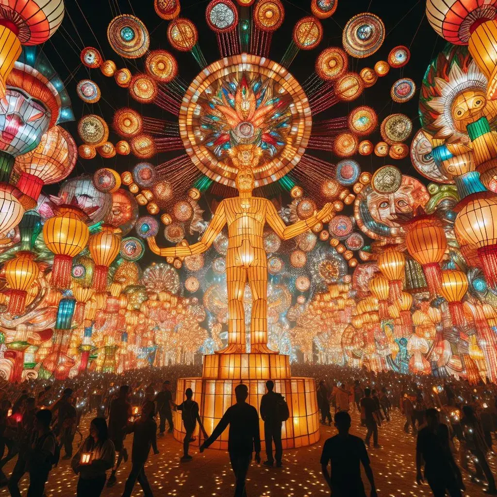
⭐Prompt: A maximalist lantern festival with thousands of lights and lanterns, and people celebrating and dancing.
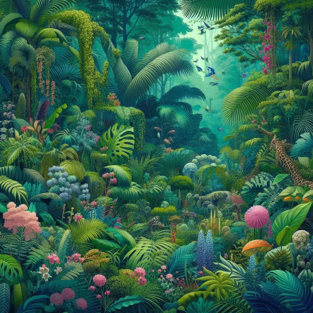
⭐Prompt: A dense, vibrant jungle scene with many different shades of green and diverse flora and fauna.
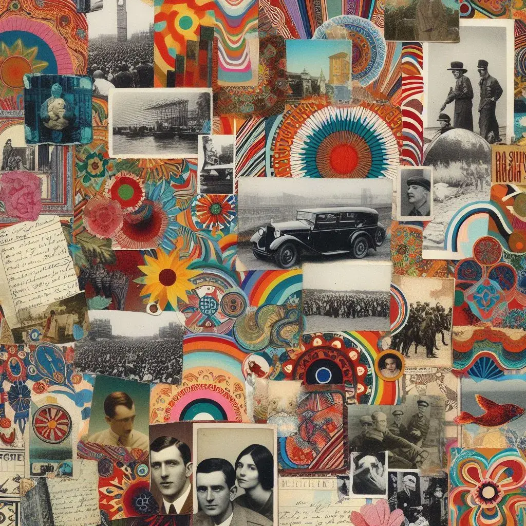
⭐Prompt: A maximalist collage featuring vintage photographs, colorful patterns, and handwritten text.
4. Let dream logic inspire you
Film director David Lynch, known for surreal masterpieces like "Eraserhead," “Mulholland Drive,” and “Twin Peaks,” has long been a cult favorite among fans and critics alike. When asked about his non-linear, often nonsensical style, Lynch often references “dream logic”—the phenomenon in which bizarre, disjointed, and just plain bonkers events can happen in a dream and somehow make perfect sense. Guided by dream logic, Lynch’s films often strive to create a feeling or impression rather than tell a strictly logical story.
Maximalist design is the same way. While you can’t completely abandon design fundamentals, you can prioritize your design’s mood, vibe, or feeling over traditional design logic. The key is to choose a central emotion or atmosphere and make it the guiding star of your whole design.
In maximalism, the prevailing mood is often one of opulence and fantasy—think "Moulin Rouge" or "The Great Gatsby."
But ultimately, it doesn't matter whether you're channeling the decadence of Marie Antoinette or the brooding weirdness of an Edgar Allan Poe story. Just pick a mood, and make sure every element in your design reinforces that central feeling.
A few options include:
- Wild and untamed, like a lush, overgrown jungle
- Dark and mysterious, with a hint of gothic intrigue
- Vibrant and energetic, bursting with life and color
- Nostalgic and whimsical, evoking the charm of bygone eras
How to create a feeling
Once again, you can use Image Creator to create standalone elements or the whole design. A few extra prompting tips may be warranted here:
- Use descriptive, emotion-laden language in your prompts to convey the desired mood. For example, instead of simply saying "a forest," try "a dark, enchanted forest filled with mystery and wonder."
- Incorporate sensory details into your prompts, describing textures, lighting, and colors that align with your chosen feeling.
- List a few specific, concrete elements or objects that represent your theme. The AI will include them, helping naturally set the right tone. In one of the prompts below, for example, I list "dancers in sequined gowns, acrobats hanging from chandeliers, shimmering silk, and gilded gold." These elements are tangible symbols of the opulent, freewheeling mood I'm aiming for.
- Experiment with artistic styles that naturally lend themselves to certain moods or atmospheres, like art nouveau, gothic, or art deco.
.webp&w=1920&q=75)
⭐Prompt: An abstract image representing the heart of Bohemia. Include swirling dancers in sequined gowns, acrobats suspended from chandeliers, shimmering silk and gilded gold, and a riot of colors including deep burgundy, midnight blue, and gold.
.webp&w=1920&q=75)
⭐Prompt: A layered paper graveyard with shadows, ghostly figures, ravens, crumbling tombstones, mist, and gothic elements. Add a grungy or burned texture to the paper for a spooky, somber look.
.webp&w=1920&q=75)
⭐Prompt: A textured collage of a retro 80's dance scene. Include neon colors, multiple patterns, and 80's-themed elements.
More is more with Microsoft Designer
Well rebels, our magical mystery tour through the wonderful world of maximalism has come to a close. Don't forget to visit the gift shop on the way out—there's a whole toolkit full of vibrant colors, rich textures, and abundant elements just waiting to throw a party on your canvas (all free of charge).
As you head over to Image Creator and set off on your own maximalist adventure, encourage yourself to say yes. Want to pair neon green with hot pink? Go for it! Feel like throwing in a few more patterns and textures? We love diversity!
The beauty of maximalism is that it celebrates eccentricity and self-expression. So, embrace the chaos, revel in the extra, and trust that your maximalist masterpiece is exactly what the world needs right now. Viva la maximal! 🏴☠️🌈❤️🔥


