Here are six tips to help you design more engaging and effective media, whether you're a trained designer or just beginning on your design journey.
Tip 1: Get to know your audience
For graphic design to be effective, it's critical to design for your audience and not yourself.
Before starting any design project, spend time thinking about the people who'll be seeing your design, and make sure you know the answers to these questions:
- Who am I designing this for?
- Where will the work be shown?
- How do I want people to feel when they see it?
- What information do I want to communicate?
- What action do I want to inspire?
Tip 2: Find inspiration and pick a direction
Sometimes it takes a minute to find the answers to all those important questions listed above, but once you've got them, you might have an idea of what you want to create and feel ready to start creating your design immediately. If you find yourself stuck or seeking inspiration, it might be helpful to create a collage or Pinterest board of inspirational imagery or media that has the vibe you're going for.
Tip 3: Pick a perfect graphic design color palette
Color is an immediate, vital way to capture attention and communicate emotion. Color can evoke surprise and delight, tap into memories, and set the tone for your message. In short, color is important.
But picking a palette of colors that work well together can be intimidating, even if this isn't your first turn at the color wheel. Here are some ideas for picking the perfect colors:
Leverage your brand: If you have brand colors or a logo to work with, pull your colors from there.
Look to nature: Pull colors from your favorite outdoor scene. Nature almost never makes mistakes; surprisingly harmonious color combinations are just outside your window.
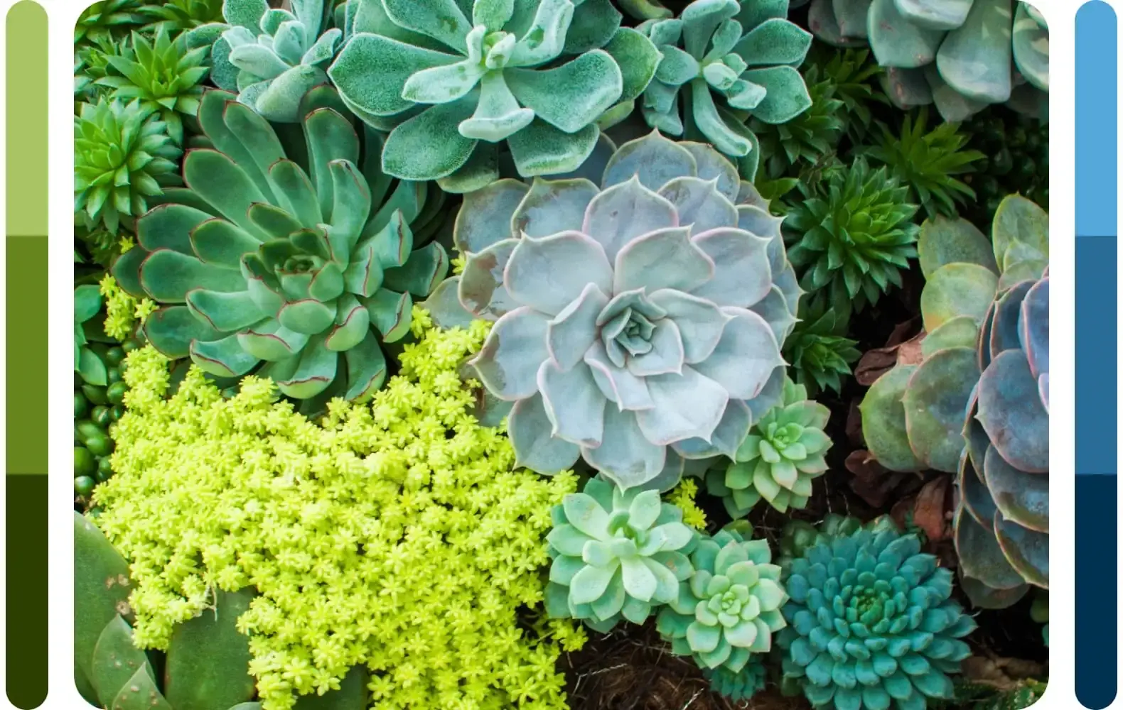
Focus on feelings: If you want to create a feeling of excitement or energy, choose warm colors in the red to yellow family. If you want to create a calm, relaxing vibe, go for cool tones like blues or greens. Keep in mind that color associations can differ across cultures and be sure that the colors you choose communicate clearly to your audience.

Pull colors from photos: If you've got an image that you'd like to include in the design, pull colors from that. Even if you're not going to use the photo in the design, but just like the vibe the picture lends, use it to build your color palette.
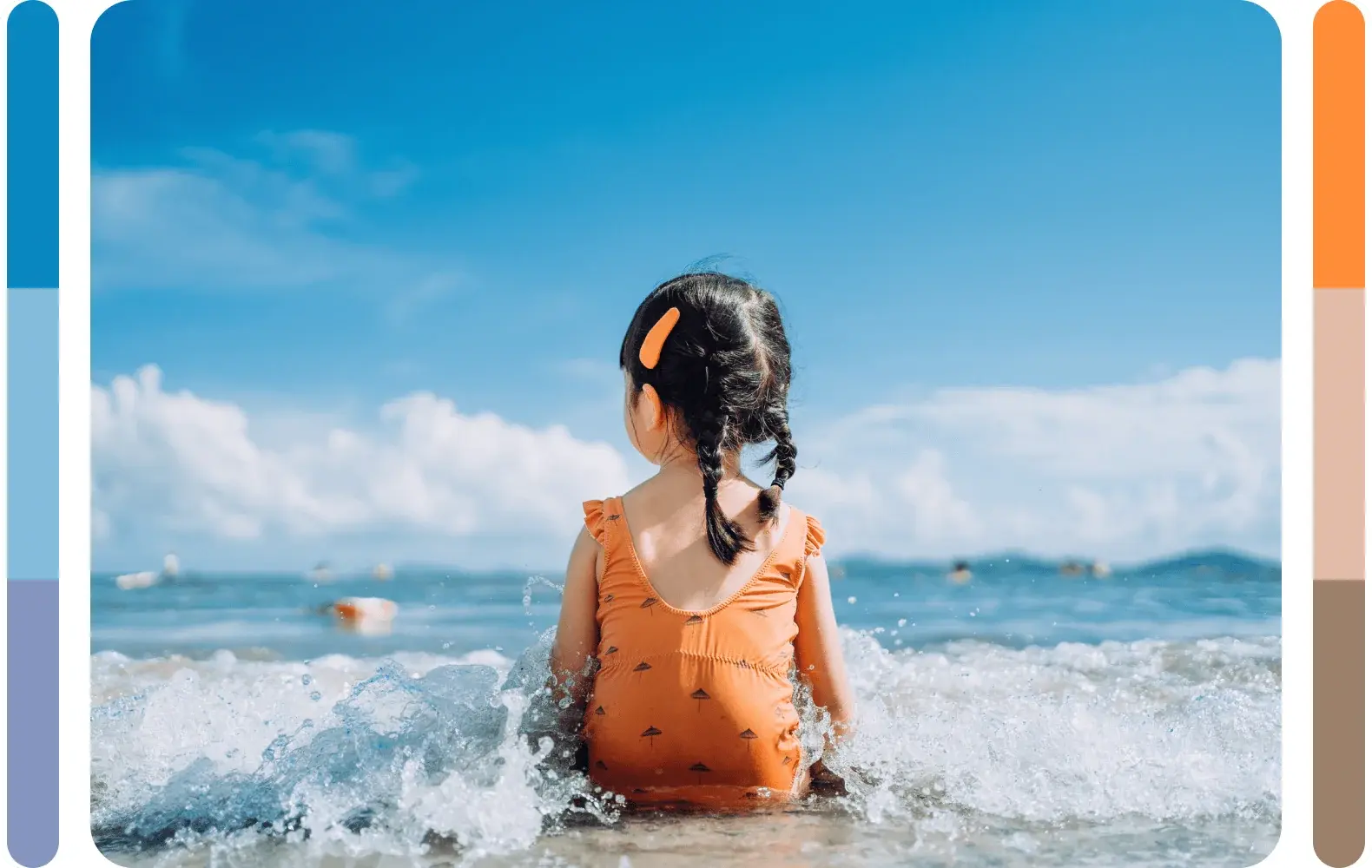
For more information about using color, see Fundamentals of color: What is color theory? by Alberto Cerriteno.
Tip 4: Include art for visual interest
Pictures and other artwork add interest to your designs and give the viewer's eye a place to rest. Photographs of people can be especially engaging, as long as they're authentic, inclusive of your audience, and true to your brand.
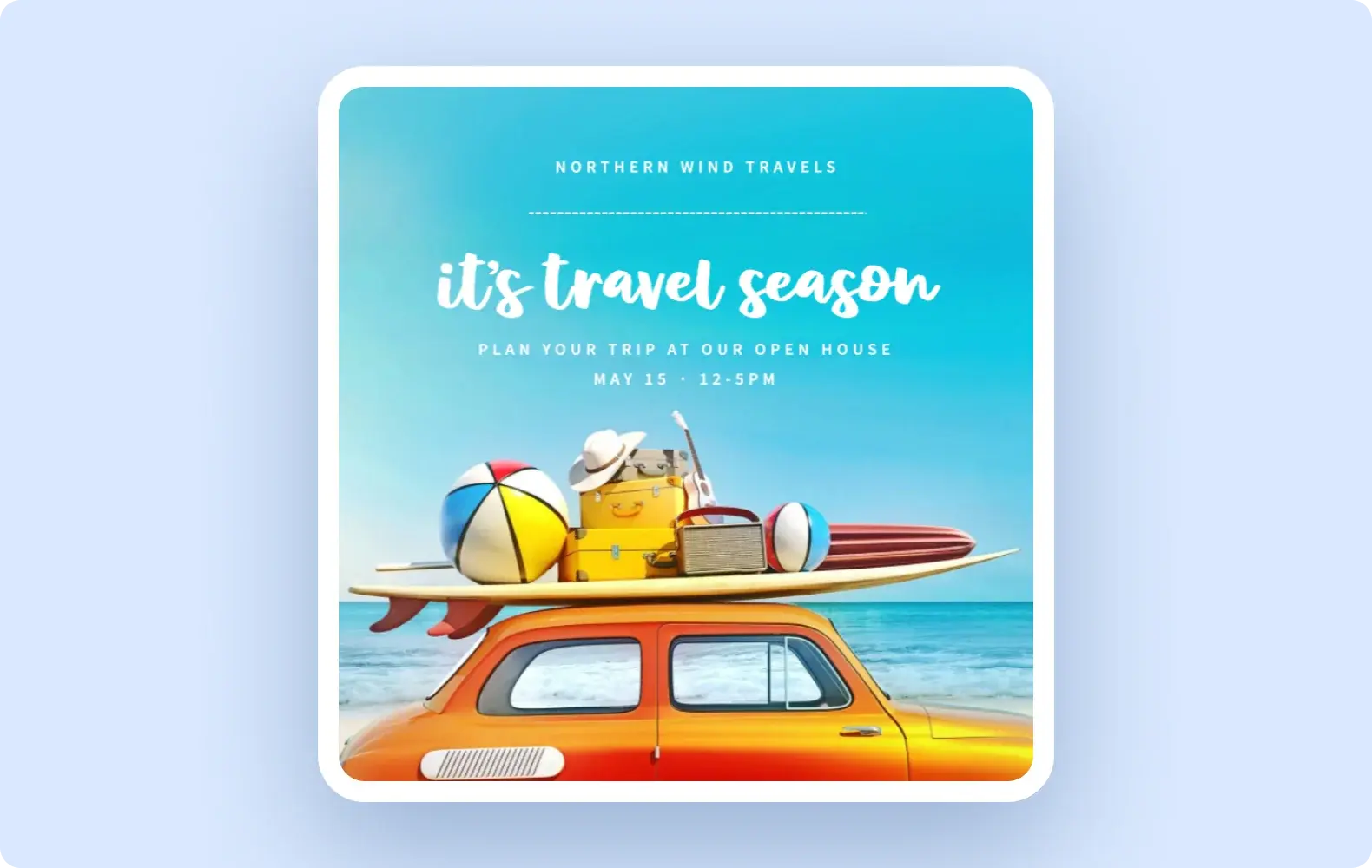
If you're using a photograph, be sure to edit it before adding it to your design. Crop the photo to remove all distractions and unnecessary elements, and be sure its focal point is clear so your audience knows where to look.
If you're looking for free, high-quality imagery, search Flickr for Creative Commons-licensed images–but remember that you'll almost always need to provide attribution to the artist. Alternatively, you can purchase high quality, royalty-free photos, illustrations, and other visual art from a company like Getty Images.
Tip 5: Emphasize your message with the right fonts
Good typography can really elevate your design, and it can make the difference between people reading your message with ease or needing to squint or avert their eyes. Here are some tips for working with fonts.
Less is more: Generally speaking, it's best to stick to only two different fonts in any design, and this includes fonts of different weights.
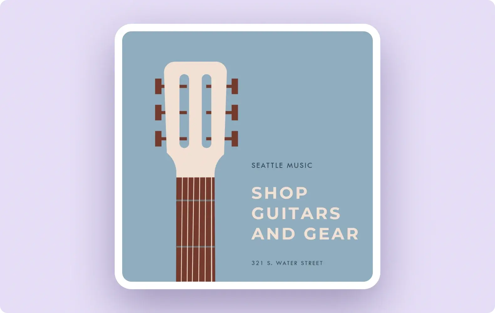
Combine different fonts thoughtfully: If you're going to include more than one font in your design, it's best to pair a classic font with a decorative one. Sometimes two classics will play well together, but things can become messy (and not in a good way) with two decorative fonts in the same design.
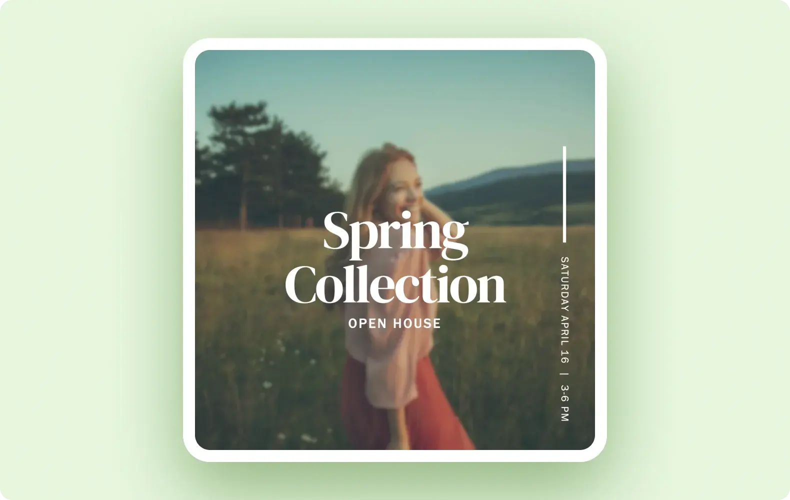
Max out at three sizes: Avoid using more than three font sizes in one design (stop at two if you can). A good approach is to use the largest font for your main message, the medium-size font for your call to action, and reserve the smallest size for those extra, less critical details.
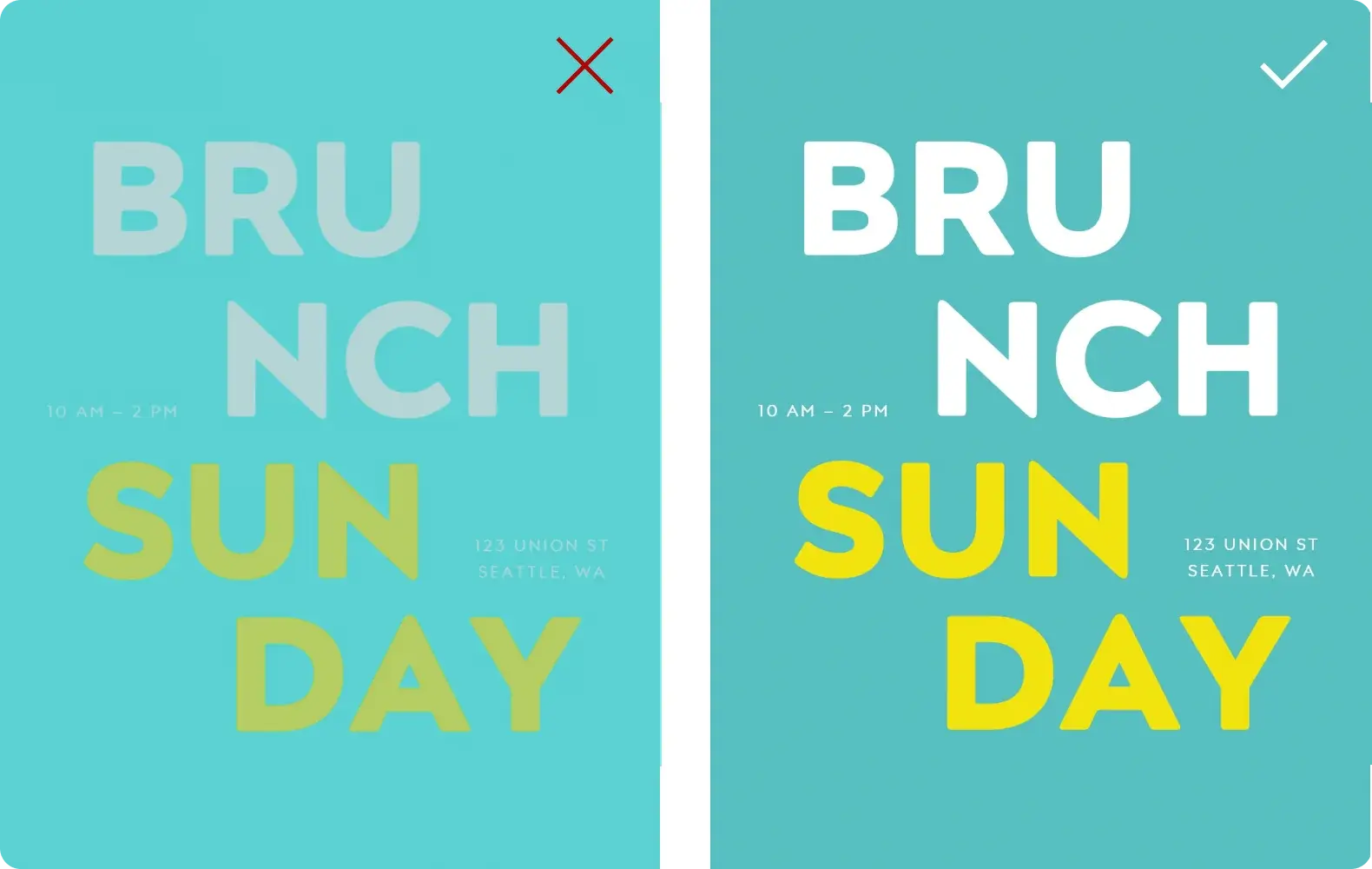
Create contrast: No matter how on point your font choices are, they won't mean a thing if your audience can't see them clearly against their background. This is important for everyone, but it's especially crucial that your designs be accessible for people with visual impairments or color blindness. There are several online tools available to help you make sure that you've got appropriate, readable contrast between foreground and background colors. For example, WebAIM's Contrast Checker.
Tip 6: Simplify, simplify, simplify
Once you've got the design nearly complete, see if there's anything you can take out. That's right: sit back and see what can be removed from the design without losing the messaging or emotion it conveys.
Good design often comes down to what's not there, as opposed to what is. Allowing for plenty of blank (negative) space in your design helps the audience focus on the important message because their attention isn't being pulled in different directions.

In the noisy, attention-seeking online world, clean, simple designs create a resting spot for your audience and can actually draw more attention and evoke feelings of calm, trust, and pleasure.
Get going, designer!
There you have it! We hope these tips help you feel more informed, empowered, and excited to create original designs or to boldly and confidently modify our beautiful Designer templates to make them truly your own.
You've got this. Start designing!


