In my last article, we explored a variety of different AI prompts to generate images in Designer.
This time, let’s learn how to use AI to generate flexible visual assets for your brand – beautiful, recognizable and consistent backgrounds and decorative elements, that create a recognizable look across all your communications.
Why generate brand assets?
If you regularly produce content, you probably already use a consistent set of colors and fonts to give all your materials a recognizable brand appearance. (The brand tools in Microsoft Designer makes it easy to define these elements and re-use them again and again!)
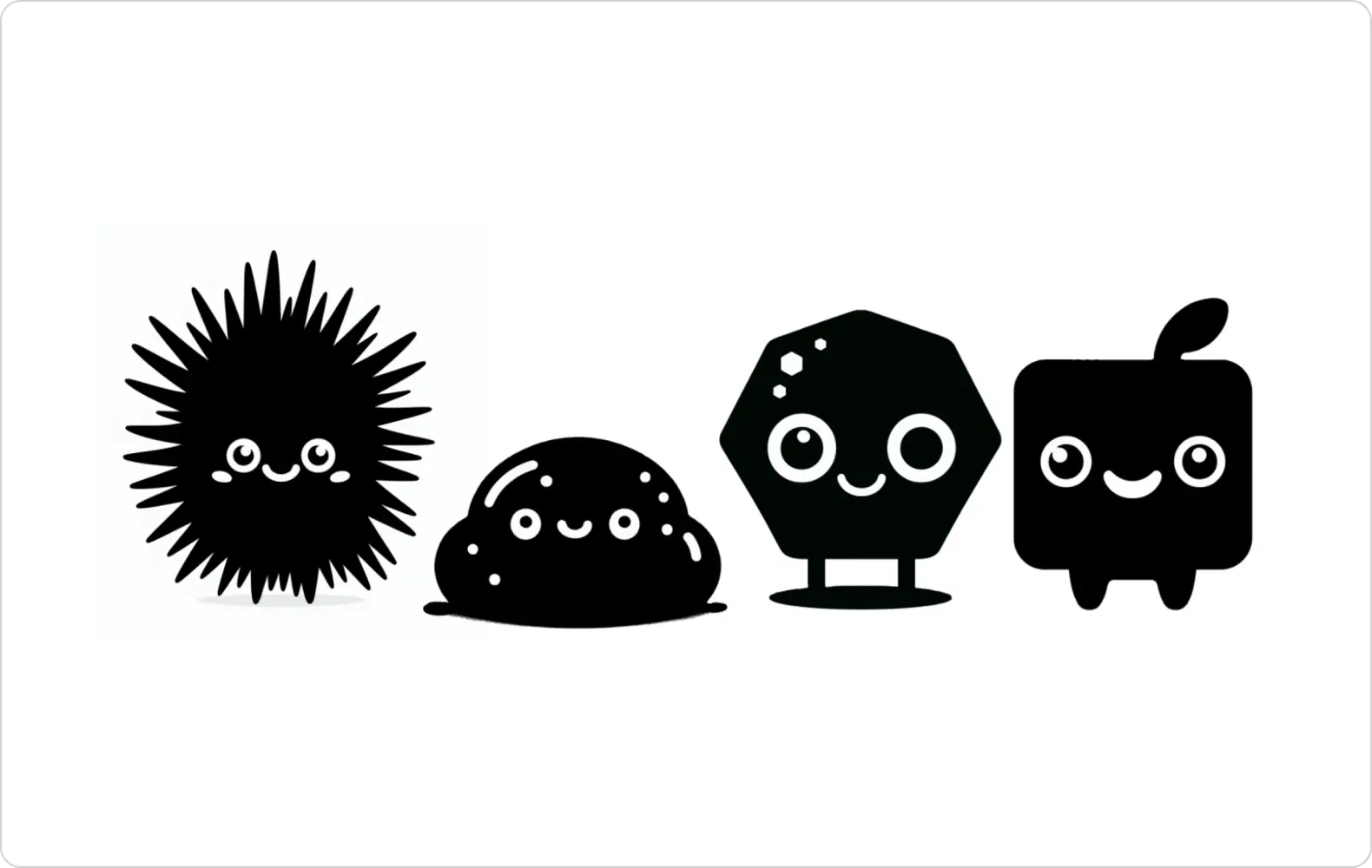 Using DALL·E , we can generate our own matching set of characters, stickers, icons, or decorative embellishments to liven up even the most functional document.
Using DALL·E, we can generate our own matching set of characters, stickers, icons, or decorative embellishments to liven up even the most functional document.
How about other visual elements, like pictures and illustrations? Of course, if you’re promoting something tangible like a venue or physical product, then you’ll probably rely on photographs of the thing you’re talking about.
But what if you’re creating content around abstract or difficult-to-visualize topics? Perhaps it’s making educational or informational materials, or promoting an upcoming event or business service that’s not easy to find exciting or relevant imagery for. (Or worst of all, a ‘terms and conditions’ section!)
Stock photographs and illustrations are a useful option, but there are drawbacks:
- although we might find individual images we like, they might not all ‘go together’, with different artistic styles employed
- they might not match the feel we want for our brand: for instance, all the photos might feel very corporate or cheesy
- you might see the exact same images used elsewhere online
In a perfect world, you could create a bank of unique and matchy-matchy images to use across all your communications, that are just as recognizably “you” as your brand palette. And now, thanks to AI, that world is here!
A good example is Microsoft itself – because they provide intangible IT services, they often use a wide range of abstract, 3D illustrations that create a modern, digital feel without depicting anything too literal.
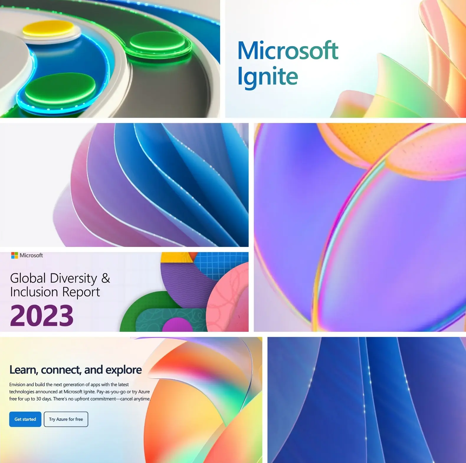
Let’s take a look at how you can create a similar effect, whatever mood you’re going for.
Creating custom backgrounds
One easy way to give your content a consistent aesthetic is through the use of a distinctive background style.
You can then use these backgrounds across all your content: social media banners, blog thumbnails, newsletters and even print materials!
And because we can generate multiple versions, things won’t start to look stale or repetitive.
Choosing your background style
To get started, head straight to Designer → Image Creator, or choose Visuals → Generate in Designer. [Tip: although all your images can be brought into Designer projects later on, only Image Creator lets you download them for safekeeping or import into other tools – so I’d recommend starting there.]
Let your imagination run riot: do you want a range of vibrant colors, or something austere and monochrome? (If you already have brand colors, you can mention them here.) Do you want soft or sharp shapes? Should it look ‘3D’ – or be more two-dimensional, like wrapping paper? Should it be digital and ‘rendered’, or analogue and handmade, like a physical artwork?
Some obvious words you might want to include in your prompts are words like “abstract, background, pattern, design element, texture, download, render, visualization, 4k, HD.” The rest is up to you!
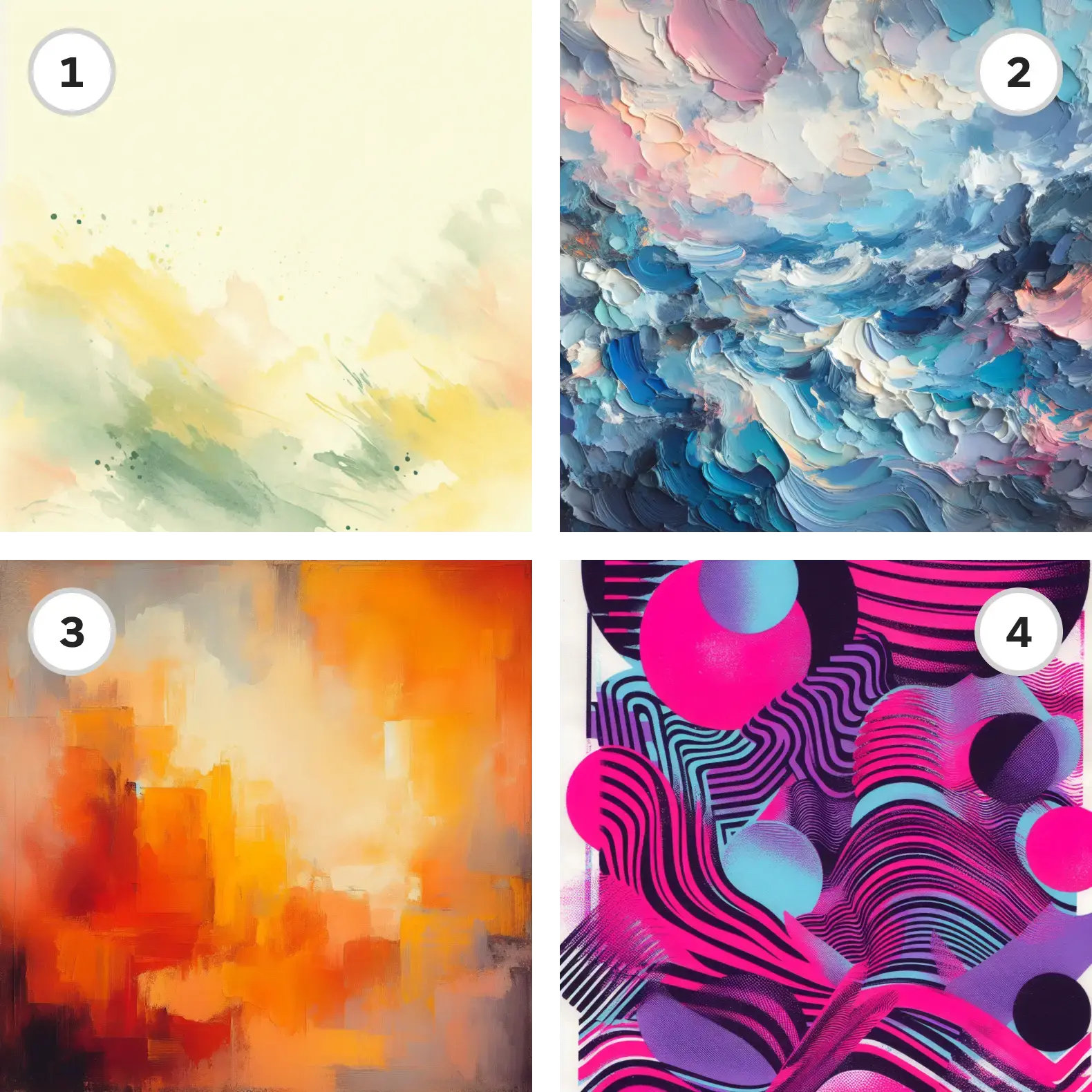
Here are some suggestions for prompts:
1. abstract background asset, soft watercolor blotches on pale background, yellow and green
2. abstract impasto, thick daubs of oil paint, impasto, blue and pink
3. abstract color field painting, orange and yellow
4. experimental risograph screenprint, abstract shapes, neon colors
5. abstract experimental photography, long exposure, light trails, open shutter, cool colors
6. abstract background, 3D render, pattern of curvilinear shapes, translucency, light effects, rounded corners, vivid bright and colorful
7. abstract background, design asset, glowing nodes on the 4D network graph, sparkling data grid, dark background
8. abstract background, repeating tribal pattern, yellow green and black, 2D vector graphic SVG
9. soft squiggly background shape doodles, repeating patterns, cute, Memphis design style, bright background colors
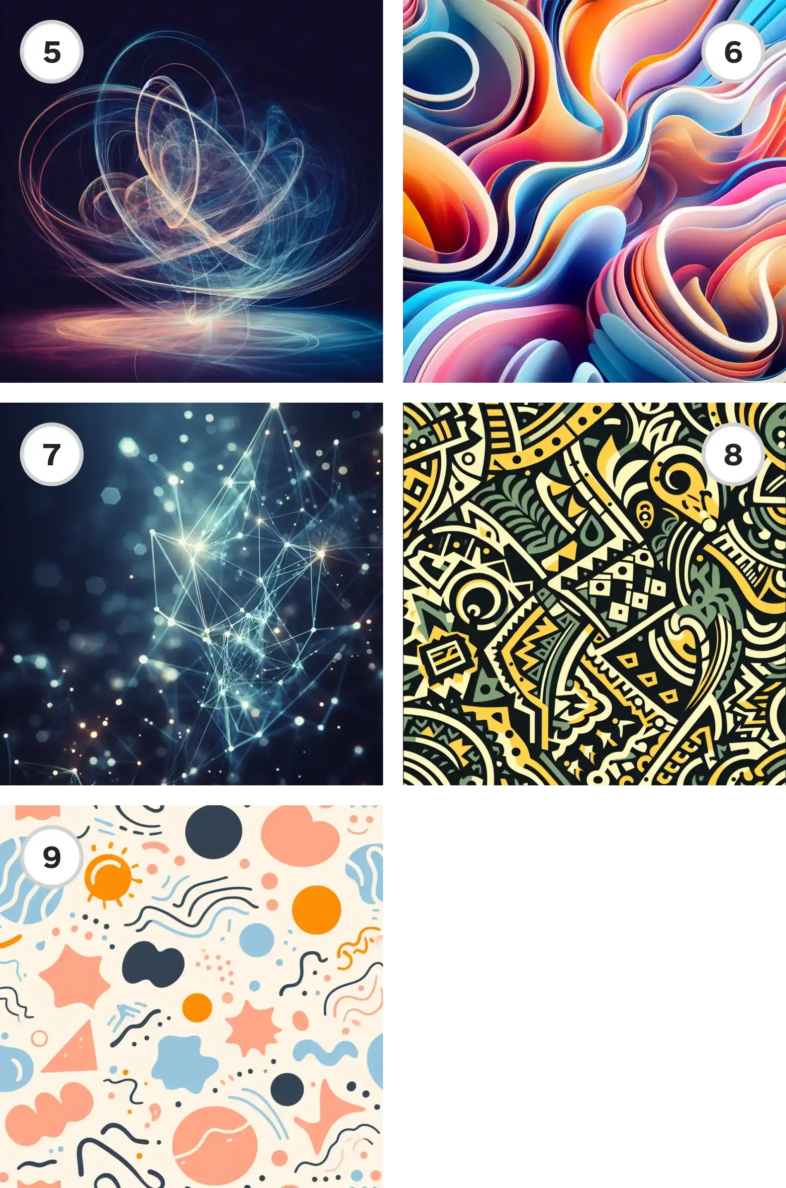
There really are limitless possibilities!
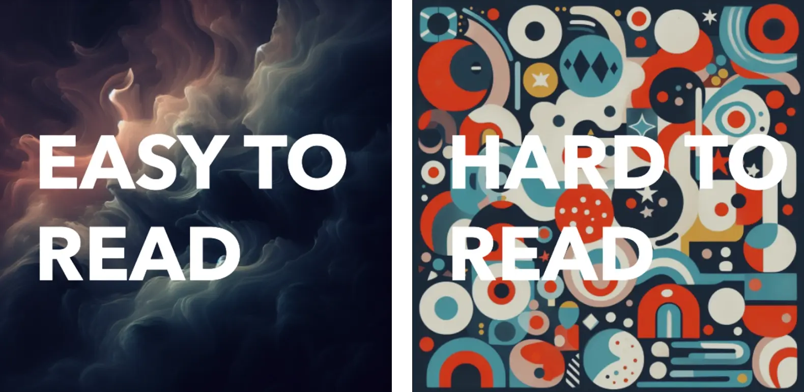
One tip: If you’re planning on setting headlines directly against the background, consider prompting for images that are softer, blurrier, darker, and lower in contrast, rather than highly patterned and vibrant.
Generating multiple matching backgrounds
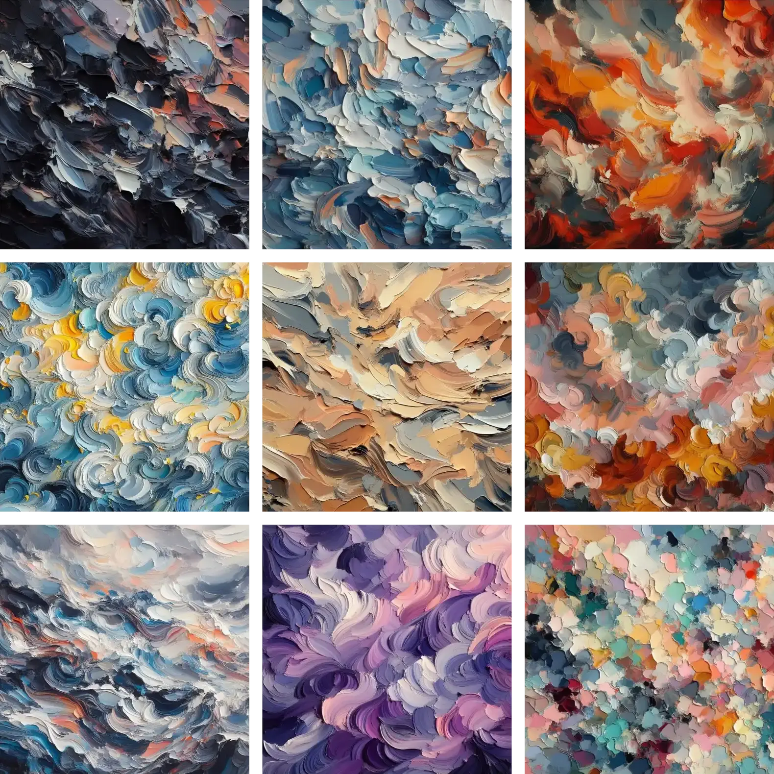
Once you’ve found the perfect style for you, you can simply run the same prompt multiple times, and download any images you think are particularly suitable. Or, you can add subtle variation to the prompts each time, to get more variety.
For example, we can include different colors in our impasto prompts, to generate a rainbow of different assets for different use cases.
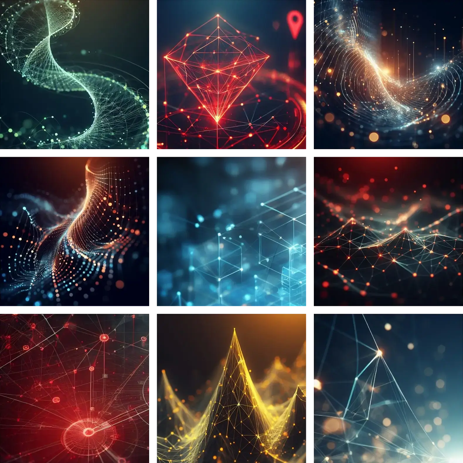
Or, for our digital ‘network graph’ style, we could include different geometry words into our prompts (like ‘helix, diamond, vanishing point, cubes, pyramids’) to create a variety of different images.
Using your backgrounds in your Designer layouts
In Designer, drag your images into the canvas from My Media. Either resize and position how you see fit, or right click the image and choose Set as background.
If your images are a bit too ‘busy’ or seem to dominate the design and distract from the foreground content, try using the Image Editor tools to reduce the brightness, contrast or sharpness, to create a more washed-out look.
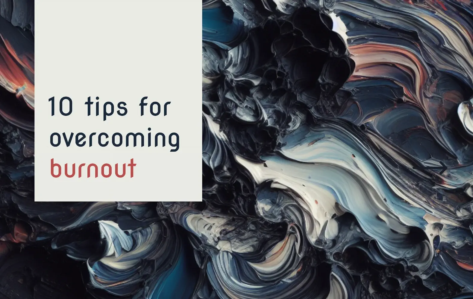
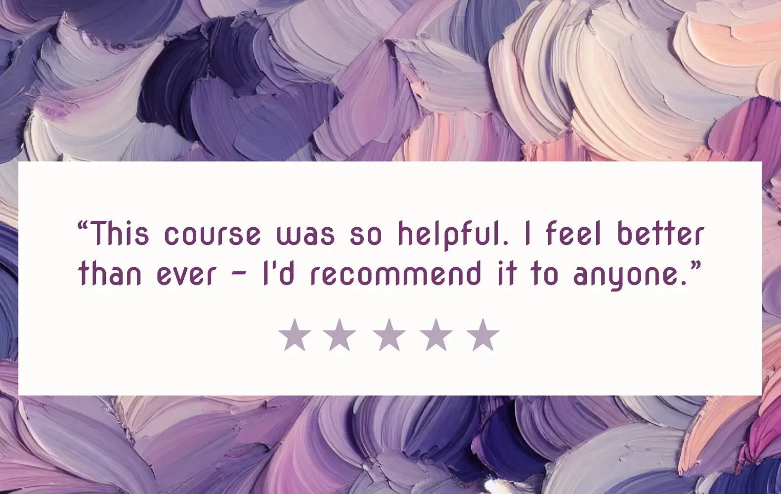
Let’s see how using a collection of similar backgrounds creates a consistent visual effect across multiple pieces of content:
Pro Tip:
You can use the color picker tool in Designer to select colors from your background image, then use them for your text and other elements. Click the ‘eyedropper’ at the top of the color palette interface, then click on your image.
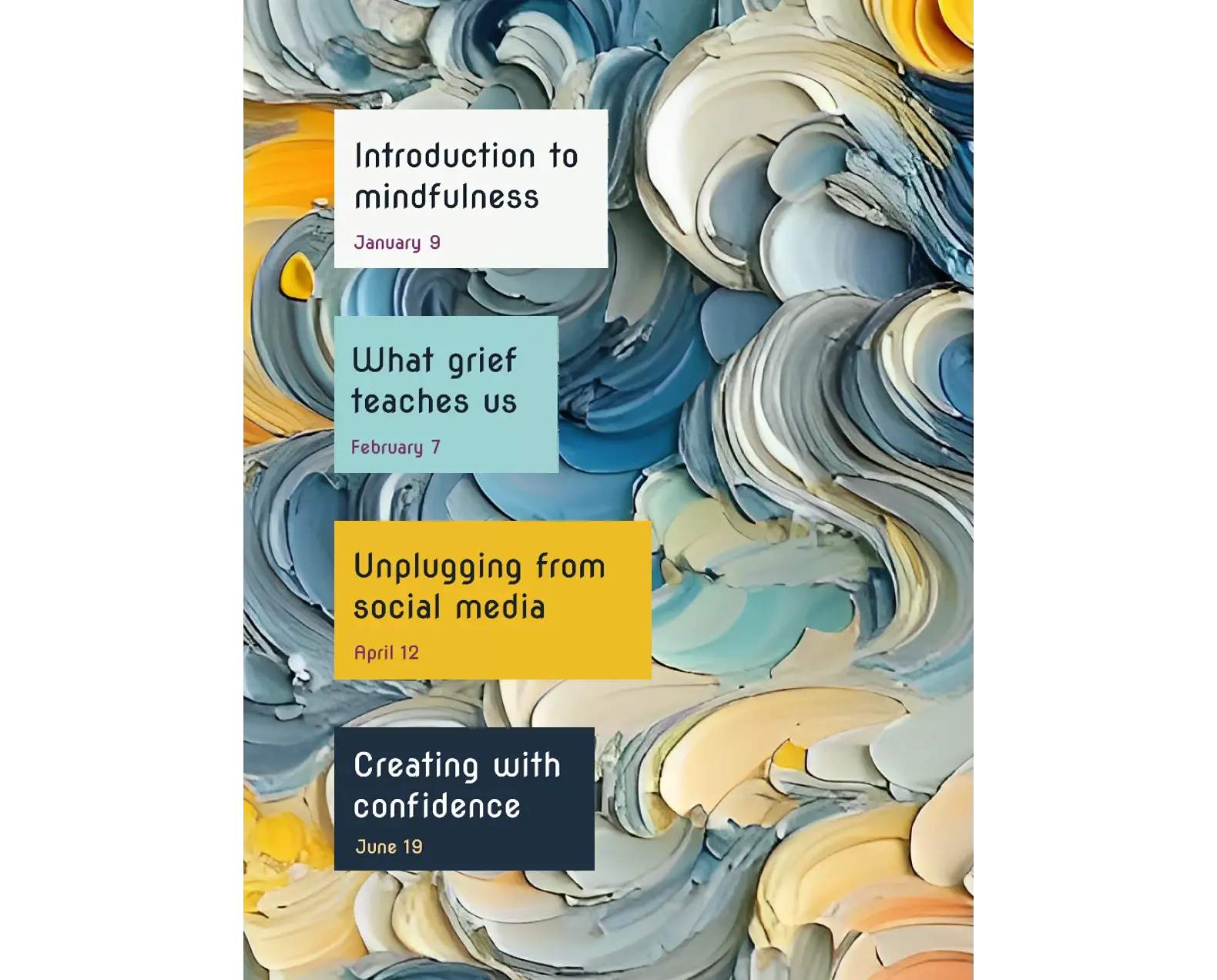
Pretty cool!
Let’s look at an alternative approach using cut-out stickers.
Generating your own assets & design elements
In this section, you’ll generate some simple visual elements you can use throughout all your materials – like your own uniquely on-brand clip art library. Using the background removal tool in Designer, you’ll be able to convert your AI generations into sticker-like assets that can be positioned on any background.
Finding an image style that works for you
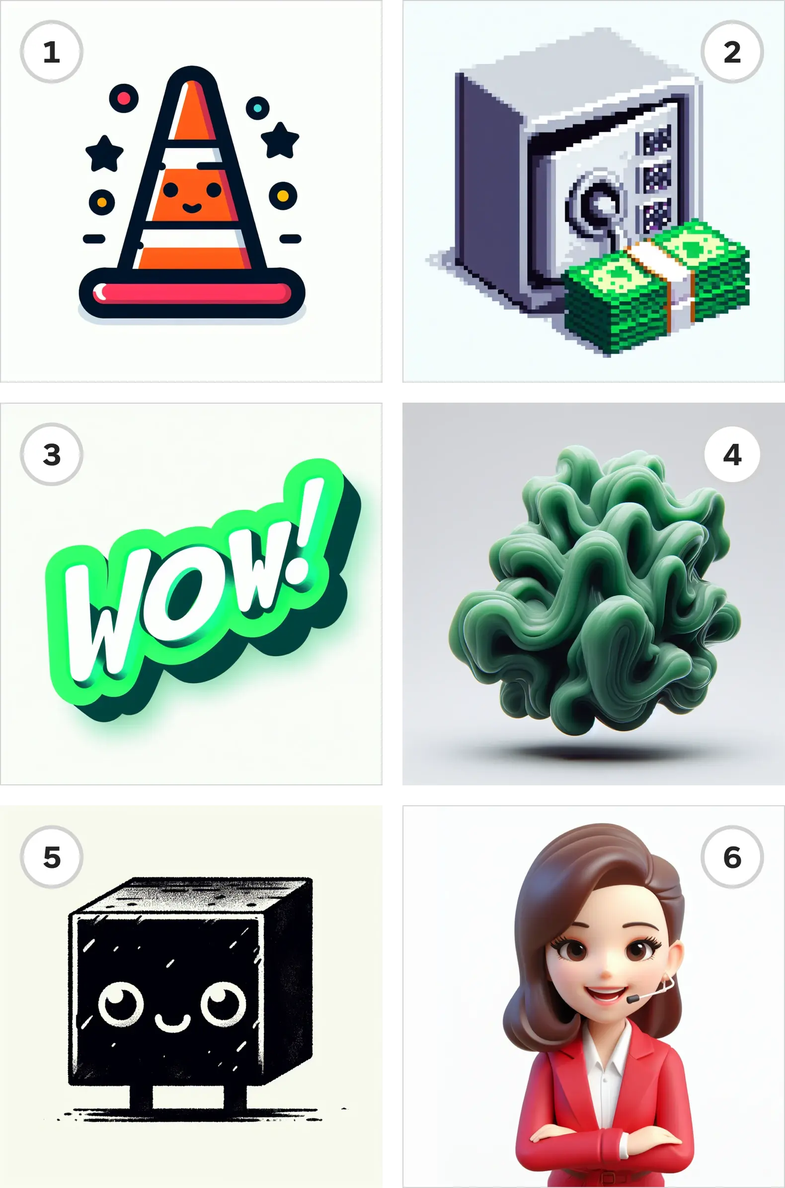
DALL·E can’t generate images with transparency (yet!), so you’ll need your image generations to have nice clean lines that make it easy to cut-out later. A simply way to do this is to include the words ‘isolated on white background’ in your prompt. (If you know you’re always going to use a particular color of background, however, feel free to define that color in the prompt.)
Here are a few examples…
Creating multiple matching images
Once again, feel free to run the exact same prompt a few times over and get as many satisfactory images as you like. Or, vary the subject, color, texture, or other attributes in the prompt, to create a diverse set of images with a similar feel.
Let’s go crazy with 3D renders!
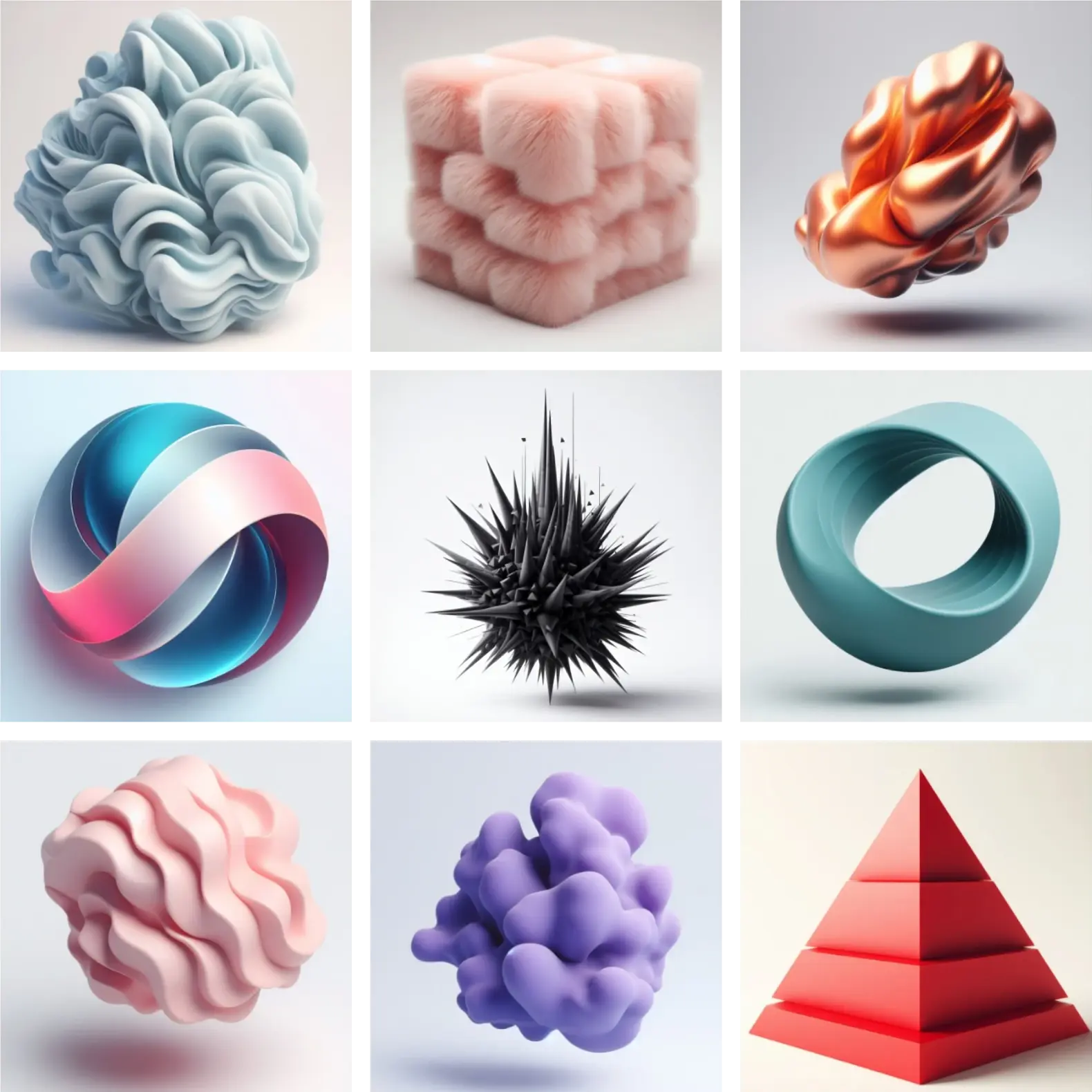 Notice the recurrent ‘shadows’ and slightly different background colors – that’s OK, we’ll take care of these in a moment.
If you’re working in Image Creator, you’ll be able to download each generation to your local machine. You can also find several hundred of your most recent creations automatically archived in your ‘Generated on Designer’ folder, but note the storage is not infinite: eventually, your oldest generations will start to disappear as you create new ones!
Using your new assets in your designs
Now we can start creating templates in Designer and bringing in some of these assets to liven up our designs. First, bring them into the canvas from My Media. Then, use the ‘remove background’ tool to cut the subjects out of their square.
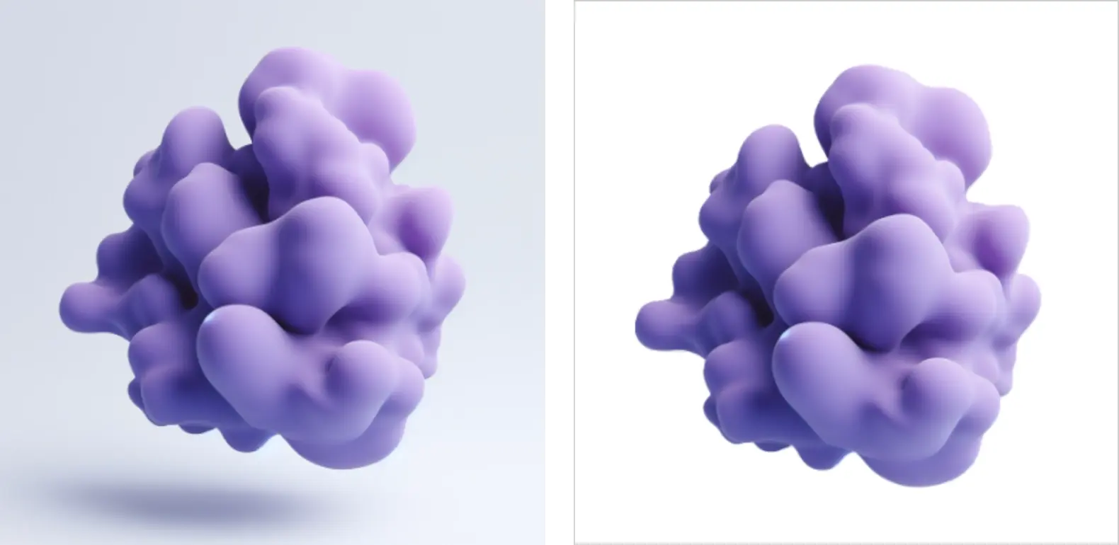 On the left, our original image; on the right, we’ve used remove background.
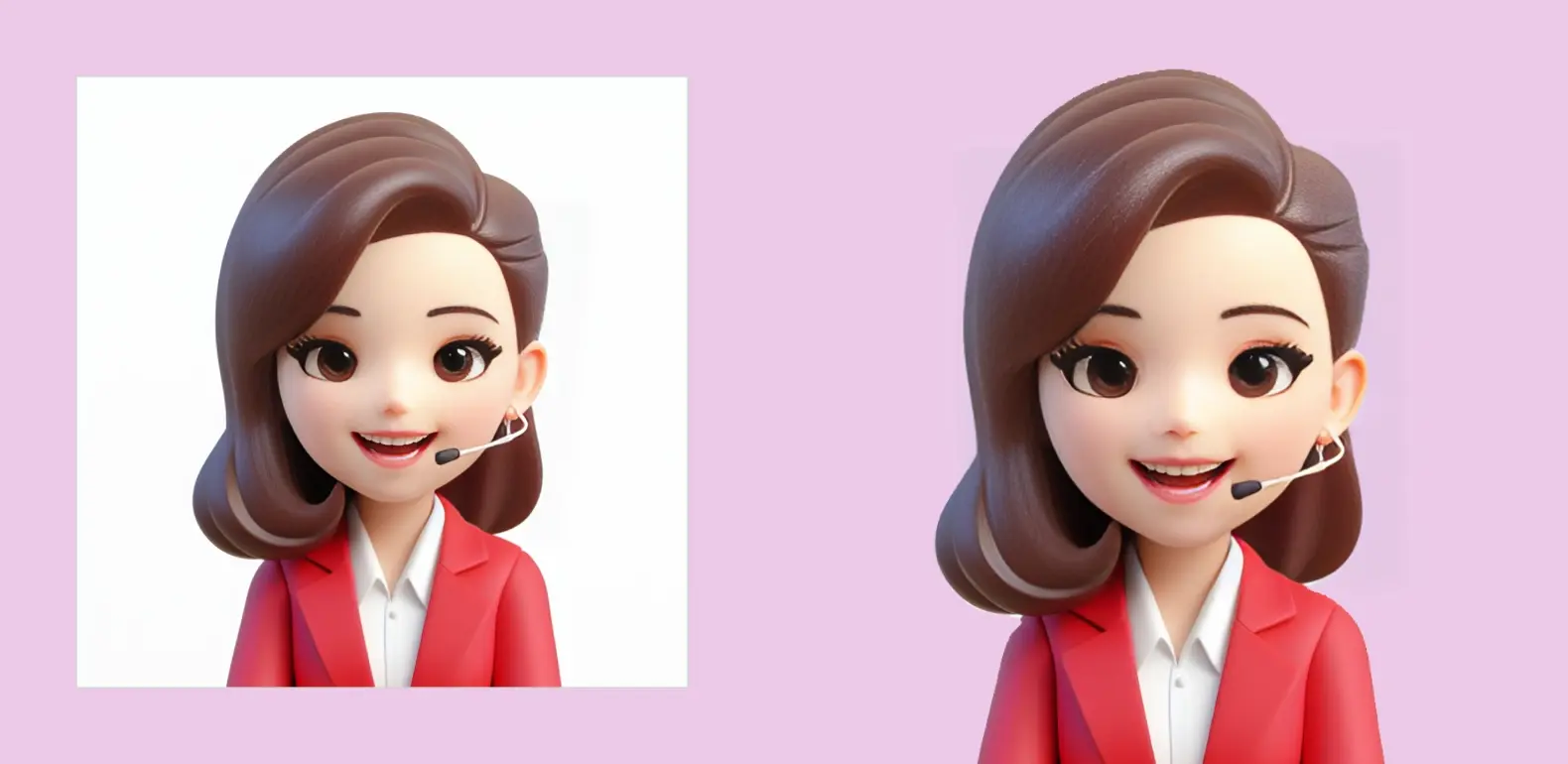
Then we can reposition them, enlarge them, use them as small stickers, or as large background elements. Here’s how that could look across a number of different posts:
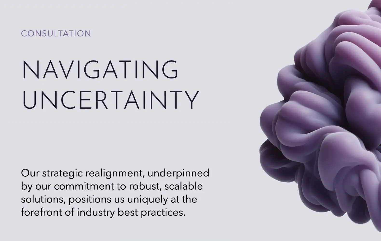
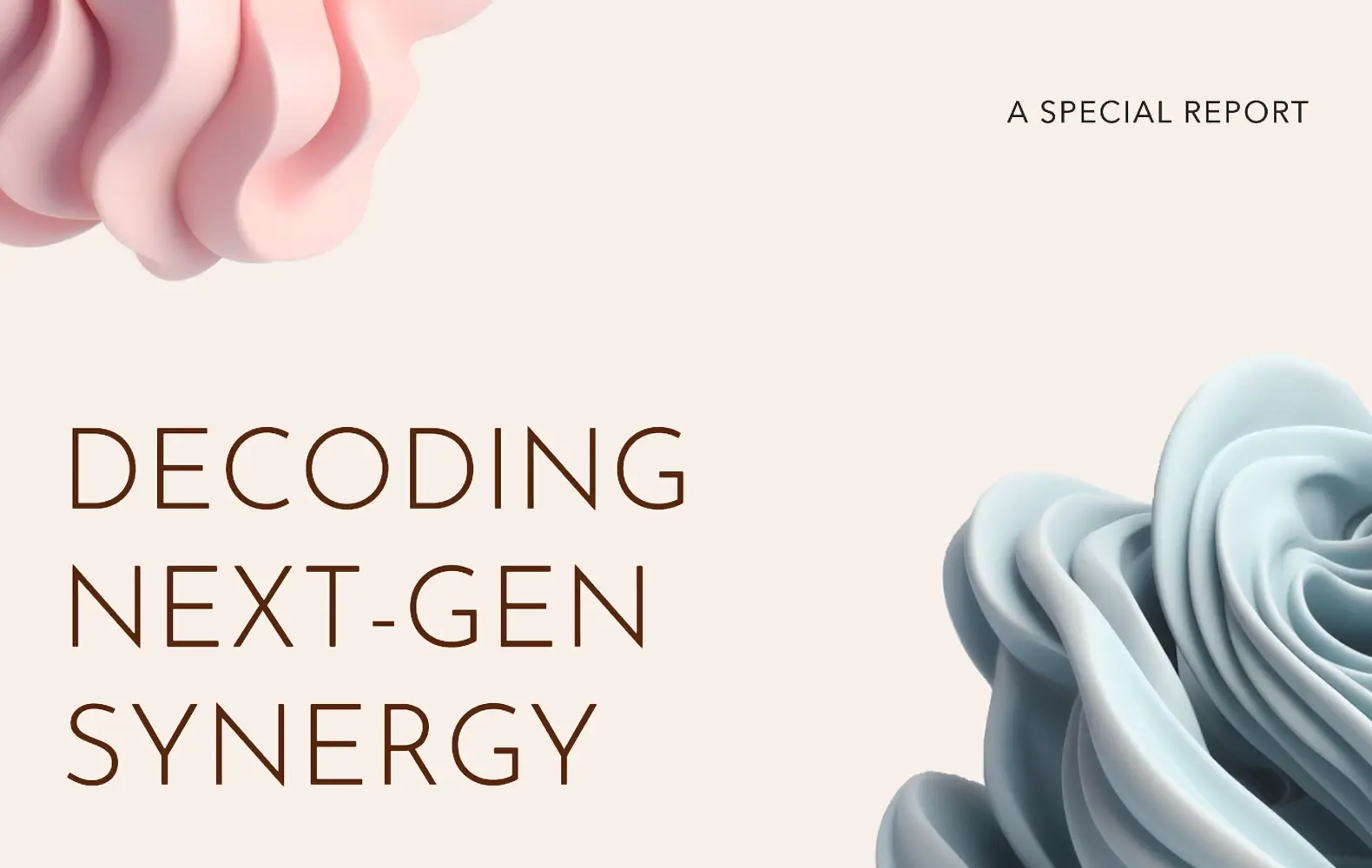
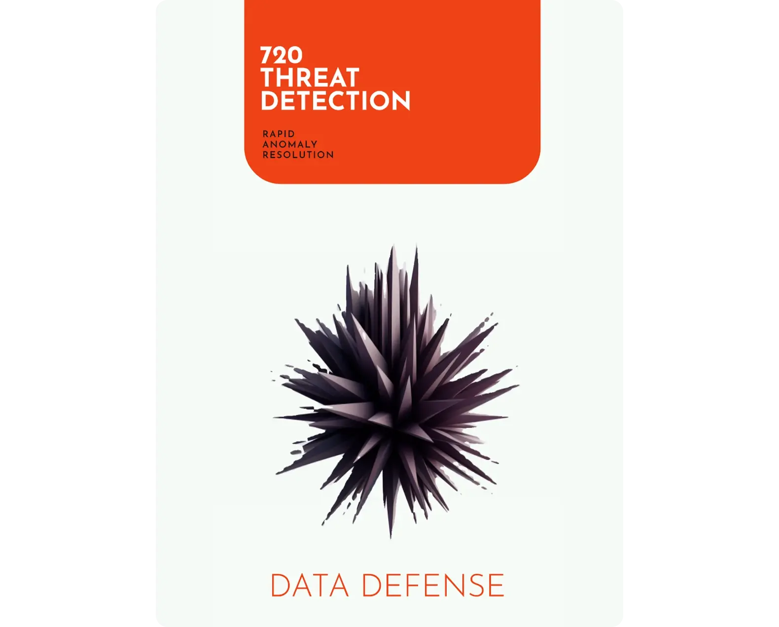
Alternative process: placing design elements in the background
The cut-out tool doesn’t work well for ornate, fiddly or detailed images without a clear ‘edge’ – but there’s still a way to use these assets. This works best for black-and-white illustrations.
1. Drag your generated image into the canvas, as usual
2. Use the image editor tools to adjust the brightness or contrast until the edges of the box are no longer visible (e.g: by increasing brightness until off-white becomes pure white)
3. Rather than changing the color of the canvas background, go to Visuals, and choose a filled rectangle. Bring it to the front if necessary and expand it to fill the entire canvas
4. Choose a suitable color, then reduce the opacity until your asset is visible ‘through’ the filled rectangle.
The result will look a little something like this:
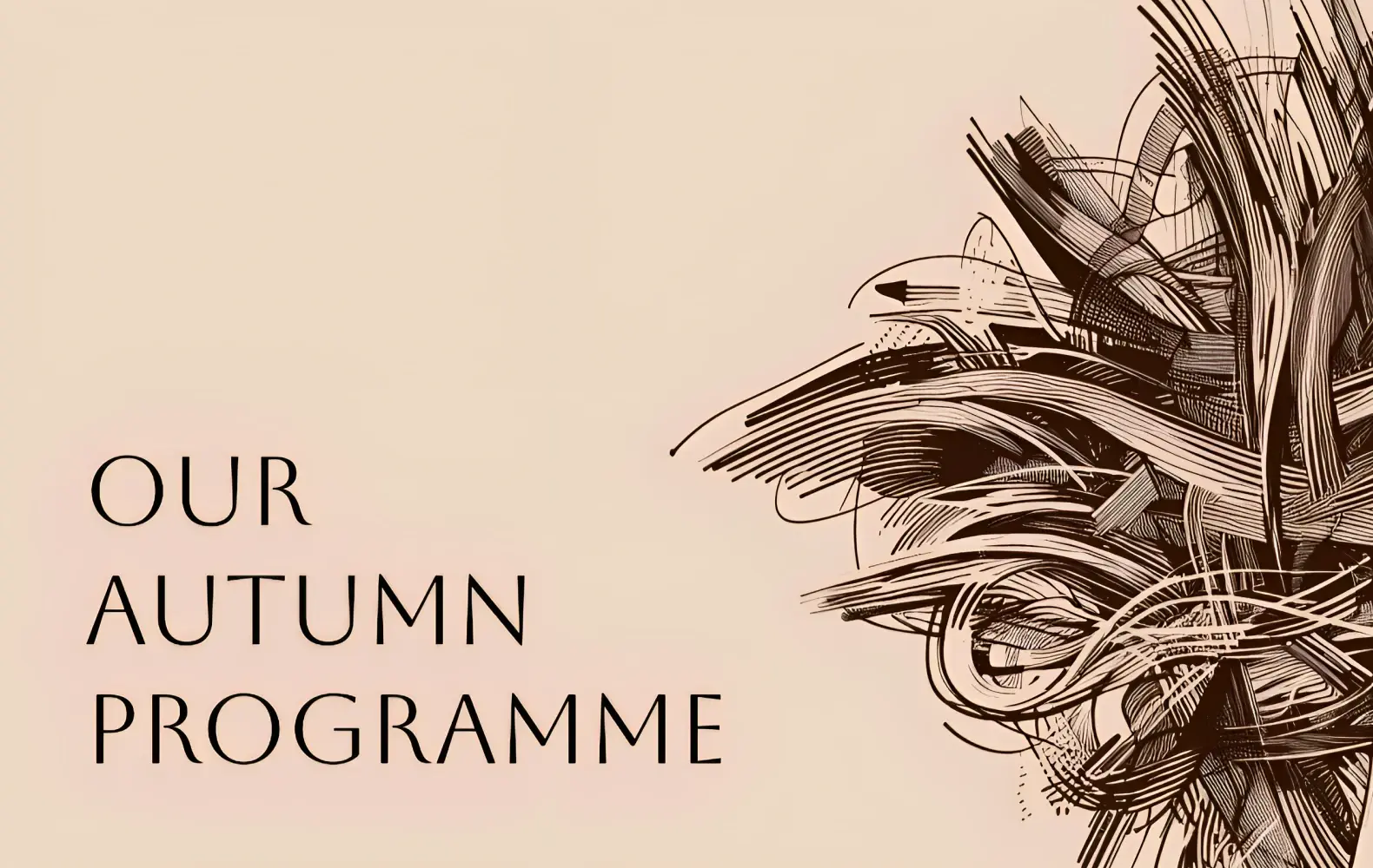
You can also use the brightness and contrast sliders to push images towards pure black and white. This helps your images blend in against a pure black or white background, which can be useful for icons, like so:
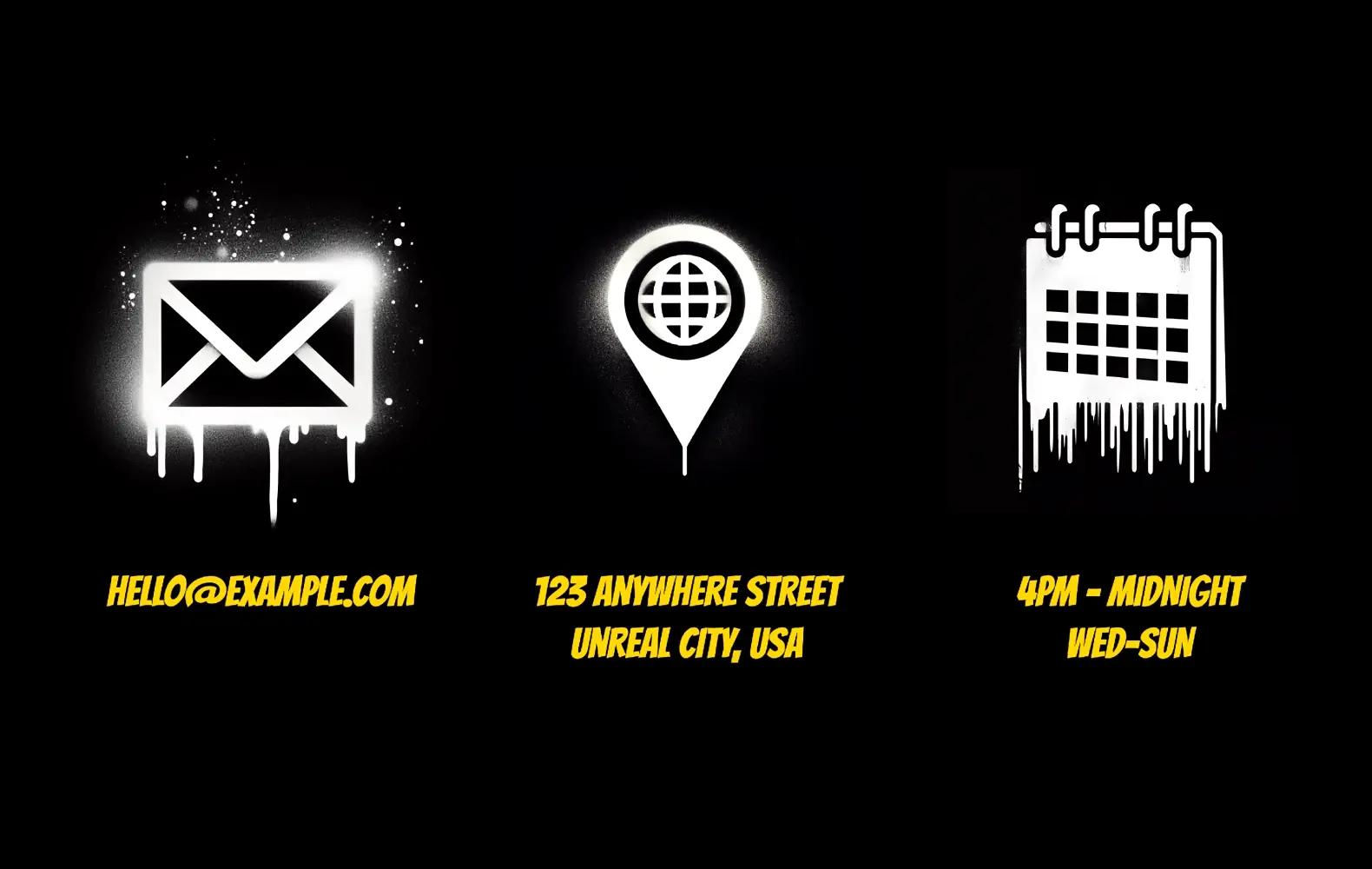 You can also use the brightness and contrast sliders to push images towards pure black and white.
Summary
Top tips to remember:
- You can use DALL·E in Designer to create exciting sets of background images and decorative assets for your brand or campaign
- Generate your images in Image Creator, so you can download your favorites
- Be sure to make a note of your favorite prompts as you go, so you can re-use them in future!
- Run the same prompt multiple times to get very similar generations
- Or adjust the prompt slightly to generate images with different colors, shapes or subjects
- In the Design Creator, find your recent generations in My Media → Generated in Designer, or re-upload older creations from your desktop
- Use the ‘remove background’ tool to cut out subjects from off-white backgrounds, or use the Image Editor and brightness & contrast sliders to push backgrounds to pure black and white


