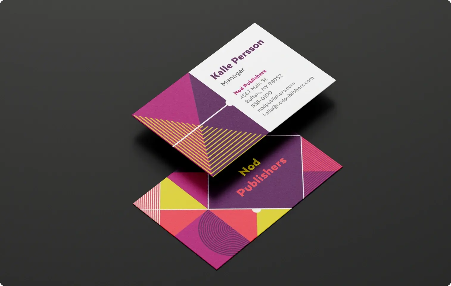
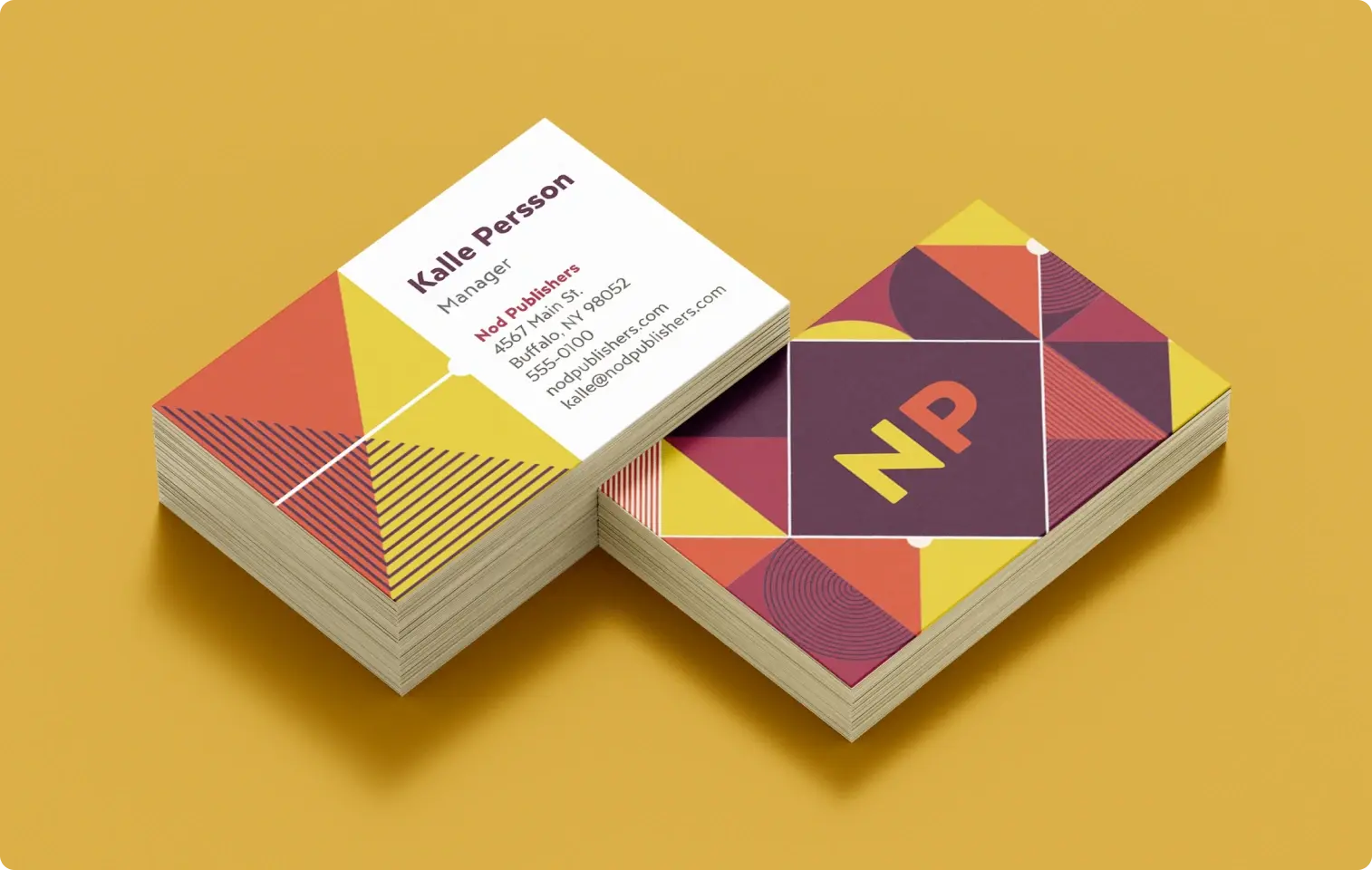
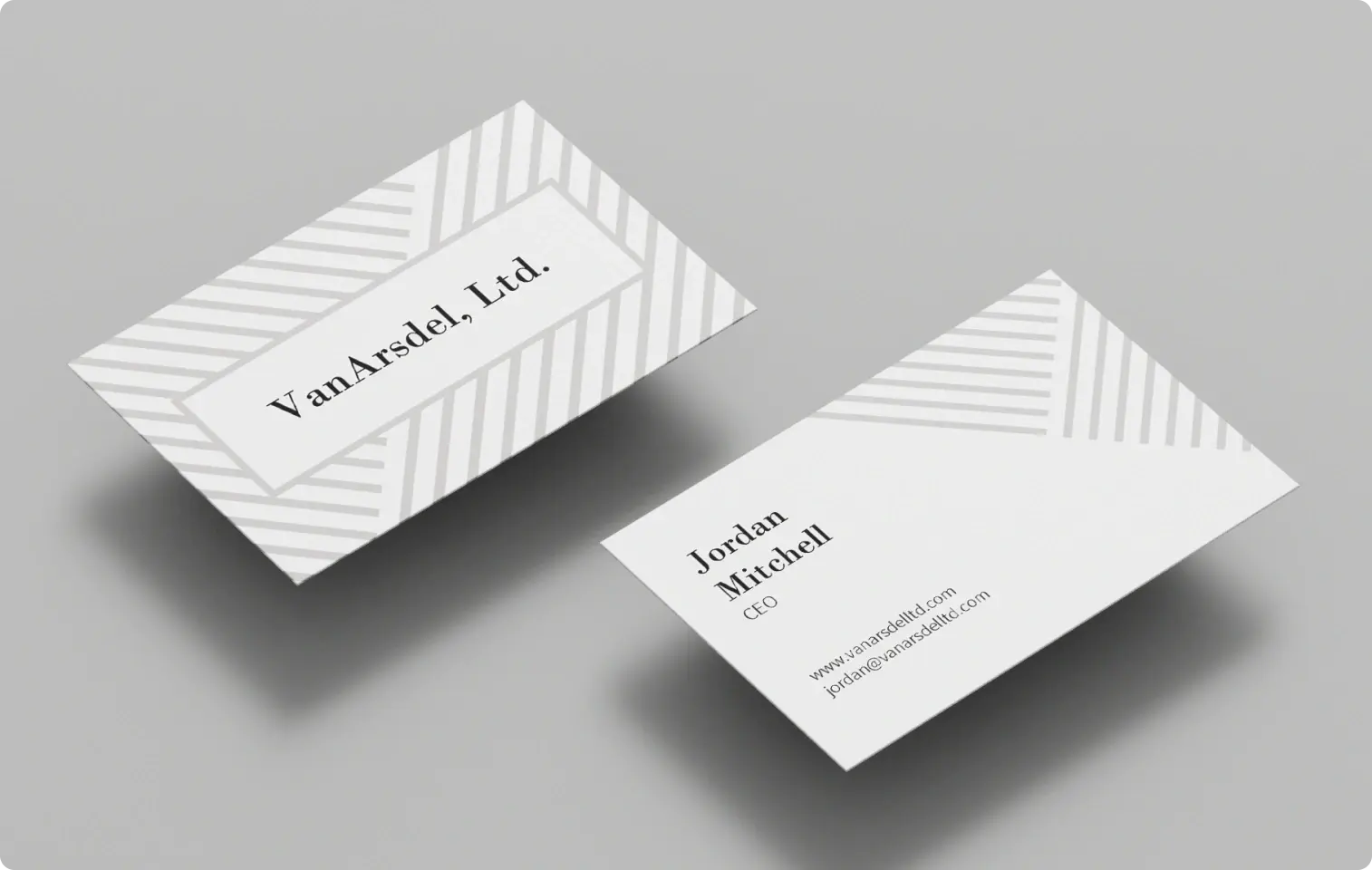
Thoughtfully designed custom business cards are an effective way to share your contact details while making a great first impression. Whether you own your own business, are growing your personal brand, or head up a local organization, business cards encourage people to reach out or stay in touch.
Why are business cards (still) important?
Business cards tell people the name of your business, provide them with a way to contact you, and give them insight into your business and personality. Well-designed, professional business cards help differentiate your business and promote brand awareness. Making your own custom business cards gives you complete control over the design and information you want to include.
What to include on your business cards
Before you begin designing your custom business cards, you need to know what to include on each card. Not only should your business cards look good, but they also need to have important information about your business.
Business name
Your business card should prioritize the name of your business, as it's what people are most likely to remember. People may also use your business card to look up your brand online, so displaying your business name prominently makes sure they'll be able to. Generally, your business name should be the largest piece of text on your card.

Logo
If your business has a professional logo, include it on your business card. Logos add to the aesthetic design of your cards and help people remember your business more easily.
Your name and title
When you introduce yourself to someone for the first time, they might not always remember your name or your position. Including this information on your business card will make you unforgettable.
Contact information
Include your email address and phone number to make it easier to reconnect in the future. Be cautious about including your personal phone number on your business cards, especially if you plan on distributing them to a large number of people. If your business has a physical location, it's a good idea to include that address on your business card as well.

Web info
You can also add your business's social media handles and website address to make it easier for people to engage with your brand online.
Tips for creating your custom business cards
Once you've nailed down the important details you'll include on your business cards, think about how to design your cards to make your business stand out. A professional, creatively designed business card leaves a great impression in the mind of a potential client or customer.
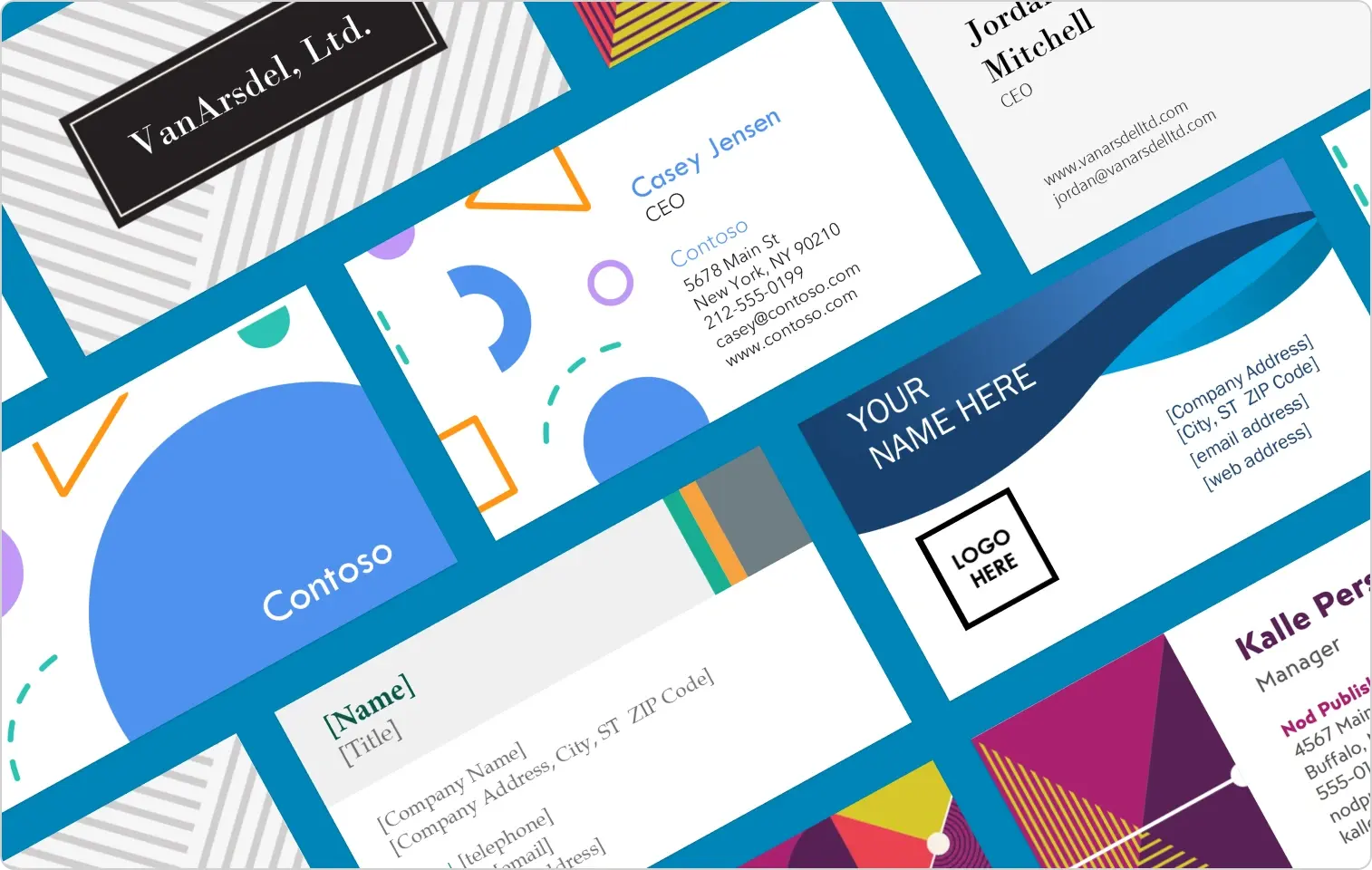
Luckily, you don't have to design these alone. Microsoft Create has your back with beautiful, professionally designed business cards that you can modify to make them truly your own.
Choose the right design
With thousands of business card templates and other Word templates to pick from, you'll need to select a design that reflects your business. Business cards for a law firm should follow a clean, simple design, while a nail salon could use colorful, bold design elements to show their sense of creativity.
Leave white space
It's tempting to cram your business card with as much information as you can, but white space makes your design more aesthetically pleasing. Too much information or design elements compete for the viewer's attention and look unprofessional.

Find the perfect font
If your business uses a specific font in branding or on your website, it's smart to carry it over to your business cards for better continuity. Your font should be easy to read and aesthetically represent your brand. As a rule of thumb, don't use more than two font styles on your business card.
Select the right text size
Whatever fonts you choose, make sure all of your text is at least 8 pts. for readability. Your business name should be the largest text on your business card, but generally shouldn't be larger than 12 pts. to leave room for your other business information.
Consider the color palette
Follow the same color palette your business uses in other branded elements. If you're using your logo on your card, make sure the rest of the design uses those shades. Complementary colors look especially pleasing to the eye because they play up each other's intensity while retaining cohesive balance.
Maximize your space
Don't forget the other side! Only including information on one side of your business card wastes valuable wallet real estate. The back side of your card is a great space to include social media handles, business tag lines, or other information that couldn't fit on the front.
Business cards help make a strong impression, whether you hand them out while networking or have a stack available at your business for customers and clients to keep. Investing an hour or so of your time to design a creative, professional custom card pays off in the long run.
Get started with business card templates from Microsoft Create.


