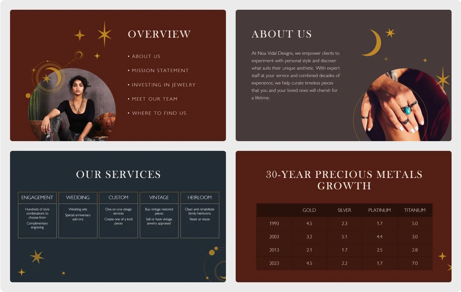
A branded PowerPoint presentation features your business's own visual language in a design template. Here, you create an effective and eye-catching way to represent your company that goes far beyond adding a logo to every slide—for your audience, it conveys an attention to detail that reinforces your brand values. Thankfully, you don't have to be a graphic design expert to create a branded presentation. Start with a professionally designed PowerPoint template and then modify it to reflect the visual identity for your business.
Why create a branded presentation?
A cohesive visual identity is one of the signifiers of professionalism to your audience. It reflects confidence and uniqueness in a world of competitors.
You might already have stationery, business cards, and a website featuring your brand's visual elements—this includes things like color palette, typography, logo size and placement, or decorative elements. It makes sense to carry this cohesion to your presentations. This is often overlooked in establishing a visual identity. Many believe that they must start from scratch, which is time- and labor-intensive. But instead of building a template from the ground up, start by selecting a design that speaks to you and modify a few simple elements to create your own branded presentation.

How to create a branded PowerPoint presentation
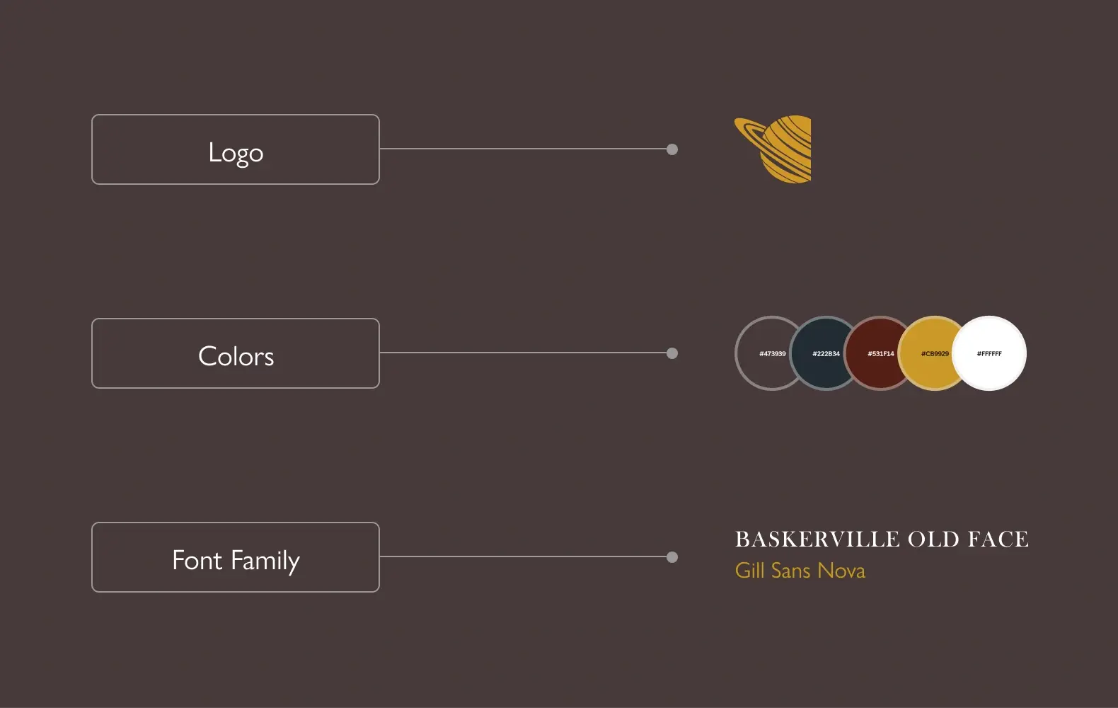
When developing a branded presentation, there are three important things to include: your logo, your brand colors, and your brand's font.

Embed your logo
A branded presentation will carry your logo on every slide, as an anchor element. But it should not be too large or distracting that it draws attention away from your content. Your first and last slides should include a large version of your logo, and on your remaining slides, this logo will move to a corner of your presentation, where it will serve as a visual reminder for your audience.

If you have a copy of your logo saved as a file, it's easy to embed into PowerPoint; here's how:
- Open your PowerPoint deck and go to the slide where you want the logo.
- Select Insert > Pictures > This Device.
- Navigate to your logo file, select it, and then select Insert.
- Select the logo and resize it (if necessary) by clicking and dragging one of the resize handles, then drag the logo to the position you want it in.
Set your colors
If you've got brand colors, here's how to set them for your presentation:
- Open your PowerPoint deck.
- Select Design.
- Under Variants (toward the right side of the toolbar), select the More drop-down and then select Colors > Customize Colors.

If you haven't picked brand colors yet and are looking for guidance, learn how to choose the perfect colors for your brand with help from the Microsoft Create team.
The relationships between groups of colors can establish a mood for your business. Color theory tells us that red means passion and blue represents calm, for example, but a trio or quartet of colors across a spectrum can mean multiple things, whether they complement or contrast with each other. To learn more, check out The fundamentals of color: What is color theory? by artist and creative director, Alberto Cerriteno.
Select a font family
A font is more than just the default text for your presentation: A font family also includes different weights (bold or lightweight, for example), italics, and special or foreign characters. Choosing a font family means versatility for anything you might want to convey to your audience.
Here's how to select the font family:
- Open your PowerPoint deck.
- Select Design.
- Under Variants (toward the right side of the toolbar), select the More drop-down and then select Fonts and then select a font family.
Tips for successful presentations
- Balance text and visuals. A wall of text will be uncomfortable to read, while too much imagery will seem unfocused.
- Enhance your content through your public speaking, but don't echo it. Use what you're saying to accentuate the content instead of dryly repeating it.
- Keep the colors balanced. Bright or distracting colors will take away from your message, even if it is part of your company's identity.
- Ensure that fonts are legible. Avoid using text that's too large and make sure that it can be read from anywhere in the room where you are presenting.
- Use charts and graphs, but sparingly. Too much data presented as visuals can be information overload.

Start with a professional template
Microsoft Create provides PowerPoint templates that can help take the guesswork out of creating a visual identity from scratch. With just a few clicks, you can edit and revise these customizable templates to match your brand.
Start by looking through our business presentation templates and downloading the ones you like best. Then modify them to build your own branded presentation.


